Coog.ai
A product asking companies to trust an AI with their hiring, on a website that did not look like it had been thought through. Conversion went from roughly 2% to over 20%.
ROLE
Product Designer · Solo
PLATFORM
Web
SCOPE
Website redesign, design system, marketing funnel, social graphics
TEAMS
PM, frontend and backend engineers, customer relations
Visit Site

What Coog does
Coog.ai automates the first stage of recruitment. A company uploads job details, candidates apply, and an AI runs initial interviews, passing only the strongest candidates through to the hiring team. It removes the most time consuming part of hiring without removing the human judgment at the end of it.
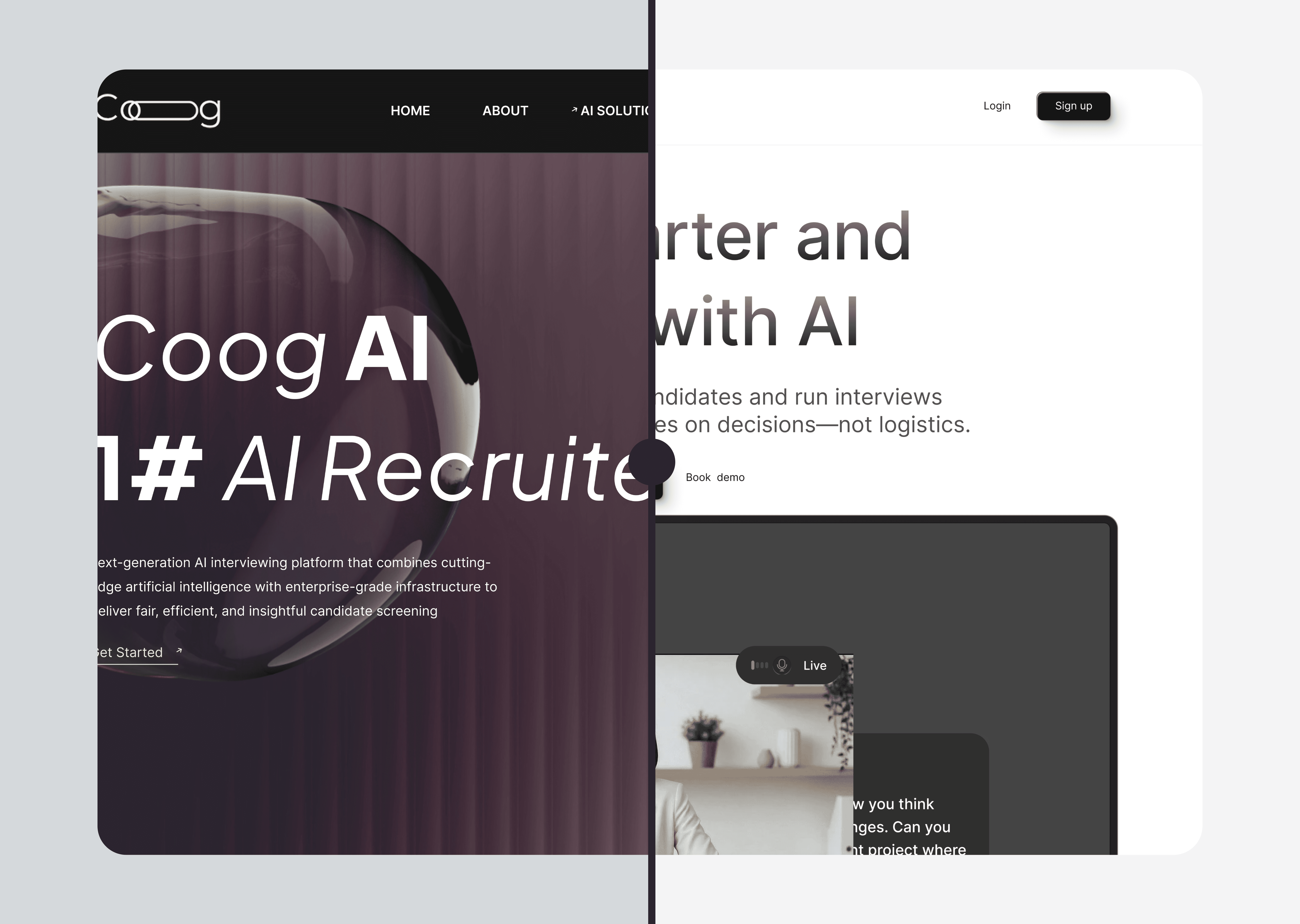
I was brought in to redesign the product website from the ground up. When I joined, daily traffic sat below a hundred visitors, and around 2% of those who arrived were signing up.
The problem was not the visuals
The old site had obvious surface problems. Mismatched components, no clear hierarchy, a layout that did not direct attention anywhere in particular. But those were symptoms, and treating them as the problem would have produced a better looking version of the same failure.
The actual issue was structural. There was no design system underneath the site. Every screen had been assembled independently, which meant nothing quite matched anything else, and the cumulative effect was a product that felt unfinished.
That matters more here than it would for most products. Coog asks a company to hand its hiring process to an AI. A visitor is answering two questions in the first few seconds: do I understand what this does, and do I believe it works. Inconsistency answers the second one badly before you have said anything. People cannot usually name what they are reacting to, but they react to it.


Decisions
DECISION 01
Build the design system before designing a single page.
This was diagnostic, not procedural. The problem was incoherence, and you cannot fix incoherence by producing better looking incoherence. The system had to exist before anything sat on top of it.
I built it end to end in Figma. Tokens for color, typography, spacing, and elevation. A component library on those tokens with documented variants and usage logic. Documentation written so the frontend engineers could implement without coming back to me for interpretation.
What it cost: weeks where nobody outside the design work could see progress. A company with a conversion problem wants a new website, not a token library, and a system is the hardest kind of work to show a stakeholder mid build. I made the case that the fastest visible fix would not hold, and asked for that time up front rather than retrofitting a system later after the same inconsistencies had reappeared.
DECISION 02
Structure the site around the buyer's skepticism, not the product's features.
Most marketing sites lead with what the product has. That works when the buyer already believes the category works. It does not work when the buyer's first instinct is that an AI should not be making decisions about who gets interviewed.
So I restructured the information architecture around the hiring manager's actual mental state. Their frustration with application volume. Their need for signal rather than more resumes. Their specific discomfort with losing control of a judgment call. Each section of the page answers a question a real evaluator is already carrying, in the order they carry them.
Working with the customer relations lead shaped this directly. Hearing the actual language prospects used, and the objections that kept recurring, changed how the site was written, not just how it was laid out.
What it cost: several genuinely good features sit lower on the page than they deserve on merit, because they answer questions the visitor has not reached yet. Feature depth got traded for sequence.
DECISION 03
Build and ship it myself in Framer.
Rather than hand designs to the engineering team, I built the site directly. Layout behavior, responsive breakpoints, and interaction details stayed under my control, so nothing got quietly rounded off in translation. The engineers stayed on the product, where their time was worth considerably more than reimplementing a marketing site.
What it cost: ownership does not end at launch. Building it meant owning the maintenance, the edge case bugs, and every subsequent change request, on a site nobody else on the team could edit. That is a real dependency to create, and it was the right trade only because the fidelity of the conversion path mattered more than the redundancy.
Results
2% to 20%+
Signup conversion
Measured against the same traffic, on the surface that was redesigned. Design driven.
<100 to 3,000+
Daily visits
A combined effort. The marketing push drove the traffic, the redesign converted it.
Being precise about attribution matters here. A redesign does not generate traffic. What it does is determine what happens to traffic once it arrives.
A better looking site does not move conversion from 2% to 20%. A site that builds trust and directs attention does.
What this confirmed
Design systems are usually justified as infrastructure for teams. Consistency, speed, less rework. All true, and all internal.
What this project showed at a scale I had not seen before is that they are also infrastructure for trust. The inconsistency on the original Coog site was not an aesthetic problem, it was a credibility problem. Visitors could feel the product had not been thought through carefully, even though almost none of them could have told you why. Fixing the structure fixed the feeling, and the feeling is what converted.
Read more of my case studies


