SiliconVerse
Two products, one engagement. An editorial dashboard built from nothing, and the front door to a two sided talent marketplace.
ROLE
Product Designer
PLATFORM
Web, B2B and consumer
SCOPE
Greenfield admin system, magazine pages, onboarding flows
Visit Site
What SiliconVerse is
SiliconVerse is a technology media company covering startups, business, and entrepreneurship across Africa. Two things happen on it. Startups get covered, hosted, and written about. Companies post jobs, and people looking for work come to apply for them.
Worth stating plainly because the company has moved since: during my engagement there was no AI in the product. No matching engine, no automated screening, nothing generative. What I worked on was an editorial operation and a two sided marketplace, and the design problems came from workflow and sequence, not from models.
My work covered two products serving completely different users. The Silicon Magazine admin dashboard, which I designed from zero across eighteen screens, plus the reader facing magazine pages. And the main Silicon Dashboard, where I worked inside a larger design team and owned the entry experience end to end.
Designing an editorial dashboard from nothing
There was no previous version. I was handed a brief and a blank canvas, which sounds like freedom and is actually the harder assignment. When you redesign something, the existing product tells you what is broken. When you design from nothing, you have to construct the problem before you can solve it.
The dashboard was for the editorial team, the people deciding what gets published, when it goes out, and how it performs afterward. Eighteen screens covering content management, the full editorial pipeline, and analytics.
The central problem in any editorial tool is sequence. An article does not go from idea to published in one step. It moves through writing, editing, review, approval, and scheduling. Multiple stages, multiple people, multiple decision points. A dashboard that cannot represent that sequence clearly does not just frustrate people. It produces missed deadlines and content reaching readers before it is ready.
DECISION 01
Organize around task state, not content type.
The obvious structure for a content tool is by content type. Articles here, interviews there, features in another bucket. It is how the content itself is organized, so it feels natural to mirror that in the interface.
I built the information architecture around task state instead. The question the dashboard had to answer in the first two seconds was not what articles exist, it was what needs attention right now. What is overdue, what is sitting in review, what is cleared to publish. That decision set the primary hierarchy and shaped every screen after it.
The tradeoff is real. Someone looking for a specific published piece has a slightly longer path than they would in a type based structure. I took that cost deliberately, because an editorial team opens this tool to find out what is on fire, not to browse an archive.
DECISION 02
Build the analytics around the editorial call, not the data.
Editorial teams are not data teams. A content editor reading performance numbers is not doing analysis for its own sake, they are deciding what to commission next.
So I designed those views around the question being asked rather than around the metrics available. Is this kind of story landing. Should we commission more of it. Is this format losing people halfway through. The numbers had to point somewhere, not just exist on a screen.
This meant leaving out data that was available and would have looked impressive in a dashboard demo. Anything that did not change an editorial decision did not earn its place.
Dense enough to run a real editorial operation. Navigable enough that nobody needs a tour.
The reader facing side
Alongside the admin work I designed the magazine pages themselves, the listing pages showing what has been published and the article views where the reading happens. I also worked with the broader team on the Silicon Magazine main page.
The design problem inverts completely here. The admin dashboard is a tool for professionals doing a job, and it can demand attention because the user has to be there. The magazine pages are for a reader deciding in about four seconds whether to stay. Every layout decision has to earn attention rather than assume it.
Contributing to the main page inside a shared design direction was a different discipline from the solo admin work. Understanding the system logic well enough to extend it without breaking it is its own skill, and one that only shows up on team projects.
The front door to a two sided marketplace
The main Silicon Dashboard is two sided. Companies post opportunities, talent comes to find them. Both sides enter through the same door, and that entry experience is what I owned.
DECISION 03
Ask which side they are on before asking anything else.
Two sided platforms have a registration problem single sided products do not. The first decision a new user faces has to orient them correctly before the product asks anything of them. Send a recruiter down the job seeker path and you have wasted their time and broken trust at the exact moment you had the least of it.
I designed that fork as the first thing a user meets, ahead of any form field, and built the login and registration flows branching from it. It is a small screen carrying disproportionate weight, because a marketplace only works if both sides can get in cleanly, and first impressions on a marketplace decide whether supply and demand can build at the same time.
I also designed the About and Privacy Policy screens. Most designers treat these as afterthoughts. On a platform where companies are sharing hiring plans and job seekers are sharing their professional history, they carry real credibility weight. Someone deciding whether to trust a platform with their career reads those pages properly. They needed to feel considered rather than templated.
To be clear about scope, this was not the full product. I worked inside a larger team and owned specific flows end to end rather than the whole surface.
What working across three surfaces taught me
One engagement, three completely different users. The admin dashboard needed operator thinking, dense information, professional users, no tolerance for workflow ambiguity. The magazine pages needed reader thinking, emotional entry points, scannable hierarchy, layouts that make staying feel effortless. The onboarding needed the mindset of someone arriving cold and deciding in seconds whether this is worth their time.
The discipline underneath all three was identical. Work out who is in front of the screen, what they need to know in the first five seconds, and build everything else in service of that.
Complexity was not the enemy in any of them. The work genuinely is complex and the users know it. The job is organizing that complexity so it stops feeling like weight.
On the missing screens.
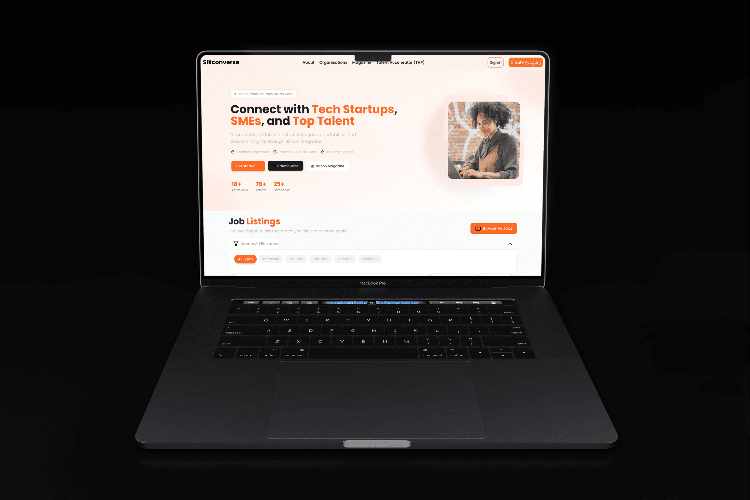
Internal screens from the Silicon Magazine admin dashboard and the magazine pages cannot be shown, as both products are still in active development under NDA. The illustrative mockup above represents the design language and approach without reproducing proprietary screens.
Read more of my case studies


