PRODUCT DESIGN CASE STUDY · 2026
Tapline
The operations console behind Nigeria's tap to pay moment. When a merchant's phone becomes a payment terminal, someone has to watch thousands of those phones at once. Tapline is the software that person lives in for eight hours a day.
ROLE
Product Designer, end to end
TYPE
Internal B2B ops console
DOMAIN
Merchant acquiring, SoftPOS

Why this product, why now
Nigeria's payments story has been a bank transfer story for a decade. That is changing fast. PalmPay is piloting NFC acceptance on its POS network. CashAfrica's CashTap lets a customer tap a phone or card on a standard terminal without typing a PIN, and its infrastructure just moved onto regulated switching rails. Apple pushed Tap to Pay on iPhone into South Africa, and industry reporting names Nigeria as the next battleground. The consumer side of that race is crowded and loud.
The side nobody was designing in public was the boring one. When an acquirer turns an ordinary merchant's Infinix or Tecno into a live payment terminal, an entire internal operation springs into existence behind it: who approved this merchant, is their phone actually working, what happens when a tap fails halfway, and did the money that tapped today actually arrive tomorrow. Those questions are answered by people at desks, inside a console. I designed that console.
One framing decision shaped everything after it. Tapline is not the tap. The customer's phone and the merchant's phone never appear in this project. The user is an operations agent at a fictional Nigerian acquiring fintech, and every screen is internal. Keeping the consumer moment entirely out of frame was the discipline that kept this a B2B system instead of another payments app with a dashboard bolted on.
The problem, precisely
SoftPOS acquiring has an operational profile unlike card acquiring on dedicated hardware. The terminals are consumer phones the company never manufactured, never configured, and cannot recall. The failure modes are ambiguous: a tap can fail on the device while succeeding on the banking rail, leaving a customer charged and a merchant unpaid, with both telling the truth. And the whole operation runs on thin margins, so the ops team stays small while the fleet grows into the thousands.
The brief I set myself: design the console that lets a team of perhaps a dozen agents run a fleet of thousands of phone terminals, where every ambiguous failure can be traced to its cause in seconds, and where the day provably closes.
Scope, and what I cut
Four modules made the cut because together they form one closed loop: a merchant is approved, their device is watched, a failure becomes a case, and the case's consequence lands in the money. Everything cut was cut for a stated reason, not silently dropped.
Cut: analytics and reporting suite.Chart dashboards are the most cloned surface in fintech portfolios. Adding one would have diluted the four problems that make this system distinct while proving nothing new about my thinking.
Cut: merchant lifecycle management.Contracts, pricing tiers, and renegotiation add screens without adding a new interaction problem. Approvals already demonstrates a decision heavy review flow.
Cut: the consumer facing tap screen.Deliberately out of frame. Its absence is what keeps the project's B2B claim honest.
Cut: roles and permissions admin.Roles exist in the narrative, an onboarding agent is not a settlement agent, but the settings screen that configures them is a solved, generic pattern. Building it would be effort spent proving nothing.
Information architecture
Five destinations, four of which are real modules. The Overview earns its place by refusing to be a dashboard: every number on it is a door into a queue. If a stat cannot be clicked into work, it does not appear.

The design system: black, white, and almost nothing else
Tapline runs on white surfaces and shades of one black, 1A1A1A stepped through 404040 and 737373, with grays doing borders and card fills. There is no brand blue, no gradient, no decorative color anywhere in the working interface. That restraint is not minimal for its own sake. In an ops console, color is a scarce resource that has to mean something, and the fastest way to make it meaningless is to spend it on decoration.
So color appears exactly three times, and each appearance is a state: red for error and conflict, green for success and health, amber for warning and variance. When an agent's peripheral vision catches amber on this interface, amber is never a brand accent or an illustration. It is always work. That is the entire theory of the palette, and it only holds because everything else stayed monochrome.
Type is Inter across the board, leaning hard on tabular numerals for amounts, timestamps, and rates. The tokens are built as a two layer variable system, primitives underneath semantic roles, with light and dark modes resolved at the semantic layer so the dark theme is a mode switch rather than a redesign.

One shift, one thread
The four modules were designed and are presented as a single continuous story: an agent approves Deluxe Phone Accessories in the morning, watches the newly provisioned TPL-4102 degrade by early afternoon, resolves the ₦18,000 dispute that device produced by using the correlation timeline, and confirms the settlement variance that refund created before the shift ends. Every screen exists because an earlier screen created a consequence for it.
That structure was the biggest bet in the project. Portfolio case studies usually show a feature's best moment in isolation. I wanted a recruiter to watch cause become effect across an entire system, because systems thinking is the thing a senior B2B role actually buys, and it cannot be faked with a beautiful screen.
What I would build next
Three things, in order. First, the merchant peek panel deserves promotion into a full investigation surface once real usage shows which fields agents actually reach for. Second, the correlation timeline should learn: resolved cases are labeled training data for pre classifying the next ambiguous tap. Third, fleet health should feed approvals, so a device model with a known NFC defect raises a flag before a merchant registering that model is ever approved. The loop that closes daily should eventually close product wide.
TAPLINE · MODULE 01 OF 04
Merchant Approvals
Before any merchant's phone can accept a tap payment, a human has to decide they are who they say they are. This module is that decision, designed as a queue an agent can move through fast without moving carelessly.
What this module has to solve
Tapline's acquiring business only grows as fast as merchants get approved. But every approval is also a risk decision. A fraudulent merchant with a provisioned terminal is not a support ticket, it is a financial liability that compounds with every tap. So the design brief was a contradiction: make agents faster and make them more careful, at the same time.
The resolution came from watching where time actually goes in document review. Agents do not spend time deciding on clean applications. They spend it hunting for the reason an application feels off. So the interface does the hunting up front. An automated match score compares the CAC registration against the BVN linked identity before the agent ever opens the record, and the queue surfaces that score as a first class column. Clean applications become thirty second confirmations. Attention pools where it should.
The score advises, the agent decides. The system never auto approves and never auto declines. That line was drawn deliberately: a model can compare documents, but accountability for provisioning a payment terminal stays with a person.
The blocker, and how it was resolved
Early versions put the document viewer and the identity check on separate tabs. In walkthroughs this created a memory tax: the agent read the CAC document, switched tabs, and had to recall the registered name while reading the BVN result. Cross referencing from memory is exactly how mismatches slip through. The fix was structural, not cosmetic. Documents and identity now sit in one continuous column, and the fields the match score compared are listed side by side with the disagreement, if any, stated in plain language. The agent verifies by looking, not by remembering.
FLOW · STEP 1
The queue, oldest first
The queue defaults to oldest first, not newest. A merchant who applied four days ago and heard nothing is a merchant who goes back to cash. Sorting by age makes the oldest promise the most visible one. Match scores render with a bar under the number so a low score is scannable peripheral vision, not a figure to read.

Grace Boutique's 61 is the reason the score column exists. Nothing about that row is alarming on its own, the documents arrived, the category is ordinary. The bar length is what makes an agent slow down on exactly the right application.
FLOW · STEP 2
Application detail, everything in one column
The agent opens Deluxe Phone Accessories. The left column holds the evidence in reading order: submitted documents, then the identity comparison with both sources laid side by side. The right column holds context that supports but never decides: application summary and risk signals. The decision bar stays pinned at the bottom of the evidence, because the decision should sit where the evidence ends.

The decision bar names the consequence, not just the action. "Approving provisions this merchant's registered device as a live tap terminal immediately" is one sentence of copy doing the work a training manual would otherwise have to.
FLOW · STEP 3
Approved, and what that sets in motion
Approval is not an endpoint, it is a handoff. The confirmation state shows the provisioning chain the decision just started, ending with the state the device will hold in Fleet: pending first tap. This is the seam where Module 01 hands the story to Module 02, and the interface says so out loud.

"Next application in queue" is the primary action, not "Done". An agent working a queue of twelve should never be dropped back to a list they then have to re enter. The interface keeps the rhythm of the shift.
TAPLINE · MODULE 02 OF 04
Device Fleet
The moment a merchant is approved, their phone stops being a phone. It becomes a terminal Tapline is responsible for, one of thousands scattered across markets, salons, and roadside shops. This module is how a small ops team keeps eyes on all of them at once.
What this module has to solve
A SoftPOS fleet has a problem a hardware POS fleet does not. Every terminal is a consumer phone the company never touched: different manufacturers, different Android versions, different NFC chips, different states of physical repair. When acceptance degrades, the merchant rarely reports it. They just apologize to the customer, fall back to a bank transfer, and Tapline silently loses the transaction. The fleet screen exists to catch that silence.
The core design decision was to rank devices by trajectory, not by state. A device that is offline overnight is usually a phone that is charging, switched off, or out of data, which is normal life in this market. A device whose tap success rate fell from 96 to 40 percent in an hour while staying online is an emergency. Early drafts used a traffic light sorted by current status, and the walkthrough proved it wrong: the offline list was long, noisy, and mostly fine, while the genuinely failing device sat mid table looking healthy because it was technically connected. The final design sorts the default view by rate of change in tap success, and the summary strip counts "Degraded" separately from "Offline" so the two are never mentally merged.
The blocker, and how it was resolved
Raw device telemetry is unreadable to the people who need it most. An NFC controller timeout surfaces in logs as a code, not a sentence, and Tapline's ops agents are not Android engineers. The tempting fix was to hide the raw logs entirely, which fails the moment an agent needs to escalate to an engineer with evidence. The resolution was a two layer log: every event renders first as a plain language interpretation written for the agent, with the raw payload one toggle away underneath. The agent reads sentences, the engineer gets the hex, and neither audience is served a compromise.
Plain language is the interface. The raw log is the receipt. Both are always true at the same time, and neither is hidden from the person who needs it.
FLOW · STEP 1
The fleet, sorted by what is getting worse
The summary strip separates degraded from offline because they demand different responses. The table's default sort puts TPL-4102, approved only hours ago in Module 01, at the top: its tap success has collapsed while the device stays online, which is exactly the failure shape this screen was built to surface.

TPL-0417 has been offline for nine hours with a 94 percent success rate. In the traffic light draft it out ranked every degraded device. Here it sits below all three of them, which matches the operational truth: it is probably a phone that is switched off, not a terminal that is failing.
FLOW · STEP 2
Device detail, sentences first, hex second
TPL-4102's detail view leads with the interpretation an agent can act on: repeated NFC read timeouts, a hardware level signal. The sparkline makes the collapse visible as a shape. Every log entry is plain language with the raw payload expandable underneath, and the primary action, flagging for a hardware check, writes to the device record so the dispute module can see it later.

The diagnosis panel commits to an interpretation instead of hedging. An ops tool that only displays data makes the agent do the reasoning. This one states what the pattern most likely means and when it started, and leaves the raw evidence one click away for anyone who wants to check its work.
TAPLINE · MODULE 03 OF 04
Dispute models
A bank transfer leaves a reference number both sides can point to. A failed tap leaves two systems, each holding its own version of one second, and they do not always agree. This module is a tool for finding where two records stopped matching, then deciding fairly what to do about it.
What this module has to solve
The hardest dispute in tap acquiring is not fraud. It is ambiguity. A customer taps, the phone shows nothing, the customer walks away, and their bank sends a debit alert anyway. The merchant swears no payment arrived. The customer swears they paid. Both are telling the truth as their own system reported it to them. Somewhere between the device's tap log and the core banking ledger, one second went wrong, and an ops agent has to find that second.
So this module was designed around a single object: the correlation timeline. It lines up the device's tap attempt log and the banking system's debit log against one clock and renders the exact moment they diverge as a stated conflict, not as two tables the agent must reconcile by eye. Everything else on the case screen, the merchant statement, the linked device history, the resolution actions, exists in service of that one view.
The blocker, and how it was resolved
The two systems do not just disagree on outcomes, they disagree on time itself. Device clocks drift, network hops add latency, and the banking ledger timestamps at posting, not at initiation. Rendering both logs on one naive timeline produced false conflicts everywhere, events that looked contradictory but were the same event recorded a heartbeat apart. The fix was a tolerance window: events within 1.5 seconds of each other are treated as candidates for the same transaction and visually paired, and only pairs whose outcomes contradict each other get flagged as conflicts. That one rule cut the noise down to the disputes that actually needed a human.
The correlation view does not decide the case. It narrows the case to one second and one contradiction, then hands the judgment to the agent with every action's consequence written next to it.
FLOW · STEP 1
The case queue, prioritized by what the fleet already knows
DSP-0142 arrived tagged high priority without any human touching it, because the dispute engine saw what Module 02 already knew: the device it happened on, TPL-4102, was flagged degraded an hour earlier. A dispute on a failing device is a different case from a dispute on a healthy one, and the queue says so before the agent opens anything.

The priority pill carries its reason inside it: "High · device flagged". A tag that explains itself saves the agent a lookup, and it teaches the queue's logic to anyone who reads it, which is how junior agents learn what seniors already know.
FLOW · STEP 2
Case detail, one second on one clock
The correlation timeline is the hero of the entire console. Device events on one side, banking events on the other, both aligned to a shared clock. At 14:32:07 the device logs a read timeout, no completed payment. At 14:32:08 the banking system posts an ₦18,000 debit anyway. The conflict is stated in words, in red, between the two events it sits between. The agent is not scanning tables. They are reading the story of one second.

Notice what the conflict box refuses to do: it does not call anyone wrong. "Both parties are reporting their own system truthfully" is the sentence that keeps an agent neutral, which is the posture a fair resolution depends on.
FLOW · STEP 3
Resolved, and the trail it leaves behind
The agent refunds. The confirmation state shows the three writes that one decision produced: the customer refund, the case closure, and the note on TPL-4102's record. Nothing here is decorative. Each line is a place another agent, or tomorrow's settlement run, will encounter this decision again.

The heading is "What this resolution changed", not "Success". A resolution in an ops console is a write to three systems, and an agent who can see all three writes will trust the tool with the next ambiguous case.
TAPLINE · MODULE 04 OF 04
Settlement
At the end of every day, thousands of individual taps have to become one number, and that number has to match what actually lands in merchants' bank accounts. When it does not, someone has to find the gap before the merchants find it first. This is the least glamorous module in Tapline, and the one that proves the whole system closes.
What this module has to solve
Settlement is where trust in an acquirer is actually earned or lost. A merchant will forgive a failed tap. They will not forgive money that tapped but never arrived. The operational reality is that variances are normal: refunds, reversals, and timing differences mean the expected total and the settled total legitimately disagree on most days. The design problem is not eliminating variance, it is making every variance explainable in seconds instead of hours.
The core decision was to treat a variance as a claim to be proven, not a number to be stared at. When a batch does not reconcile, the variance detail does not just show expected minus settled. It shows the ledger lines that compose the gap, each one linked to the event that caused it. Yesterday's ₦18,000 gap is not a mystery on this screen. It is one line, and that line is the refund from case DSP-0142, and clicking it opens the case with its full correlation timeline preserved.
The blocker, and how it was resolved
The first draft treated any variance as an error state, all red, all alarms. Finance walkthroughs pushed back hard: a batch carrying a known refund is not broken, it is correct, and painting it red trains agents to ignore red. The resolution was a three state model. A batch is Reconciled when totals match, Explained when a variance exists but every line of it traces to a known event, and Unexplained only when some portion of the gap has no source. Only Unexplained earns the warning color. The color system stops crying wolf, and orange starts meaning something again.
Variance is not the enemy. Unexplained variance is. The interface was rebuilt around that distinction, and it is the single most senior decision in this module.
FLOW · STEP 1
The daily ledger, three states instead of two
Yesterday's batch, flagged orange on the Overview since morning, sits at the top as Explained pending review: the gap exists, its source is known, and it needs an agent's confirmation, not an investigation. The batches below it show the other states doing their jobs.
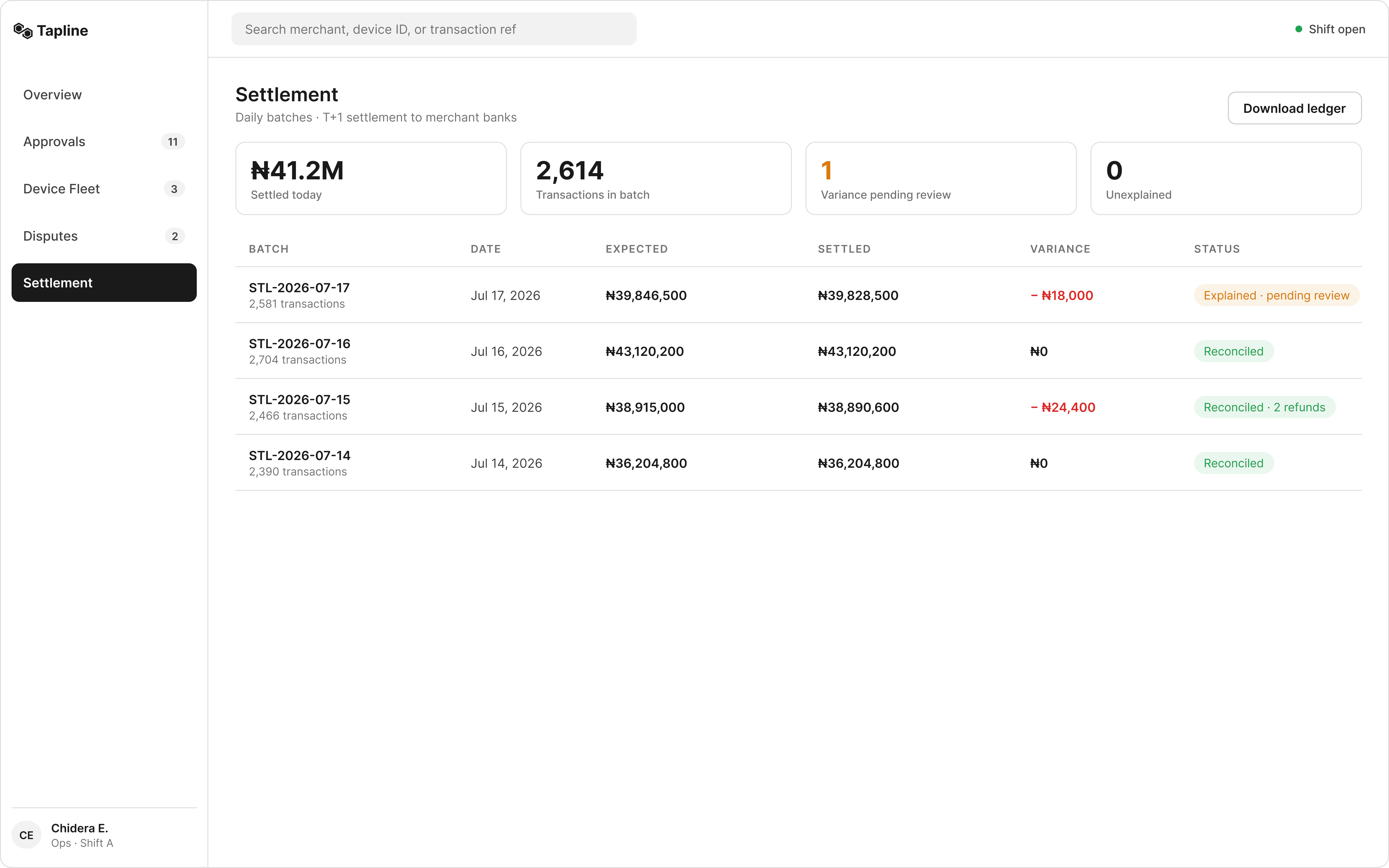
Jul 15 settled ₦24,400 short and still reads green, because both refunds composing that gap are traced and closed. That row is the three state model earning its keep: variance with a known story is a normal day, not an alert.
FLOW · STEP 2
Variance detail, the gap decomposed to its source
The agent opens STL-2026-07-17. The variance breakdown shows the ₦18,000 gap resolving to a single line: the refund issued in DSP-0142 this afternoon, linked back to the case and the device. Confirming the review closes the loop the whole shift has been walking since the morning's Overview.
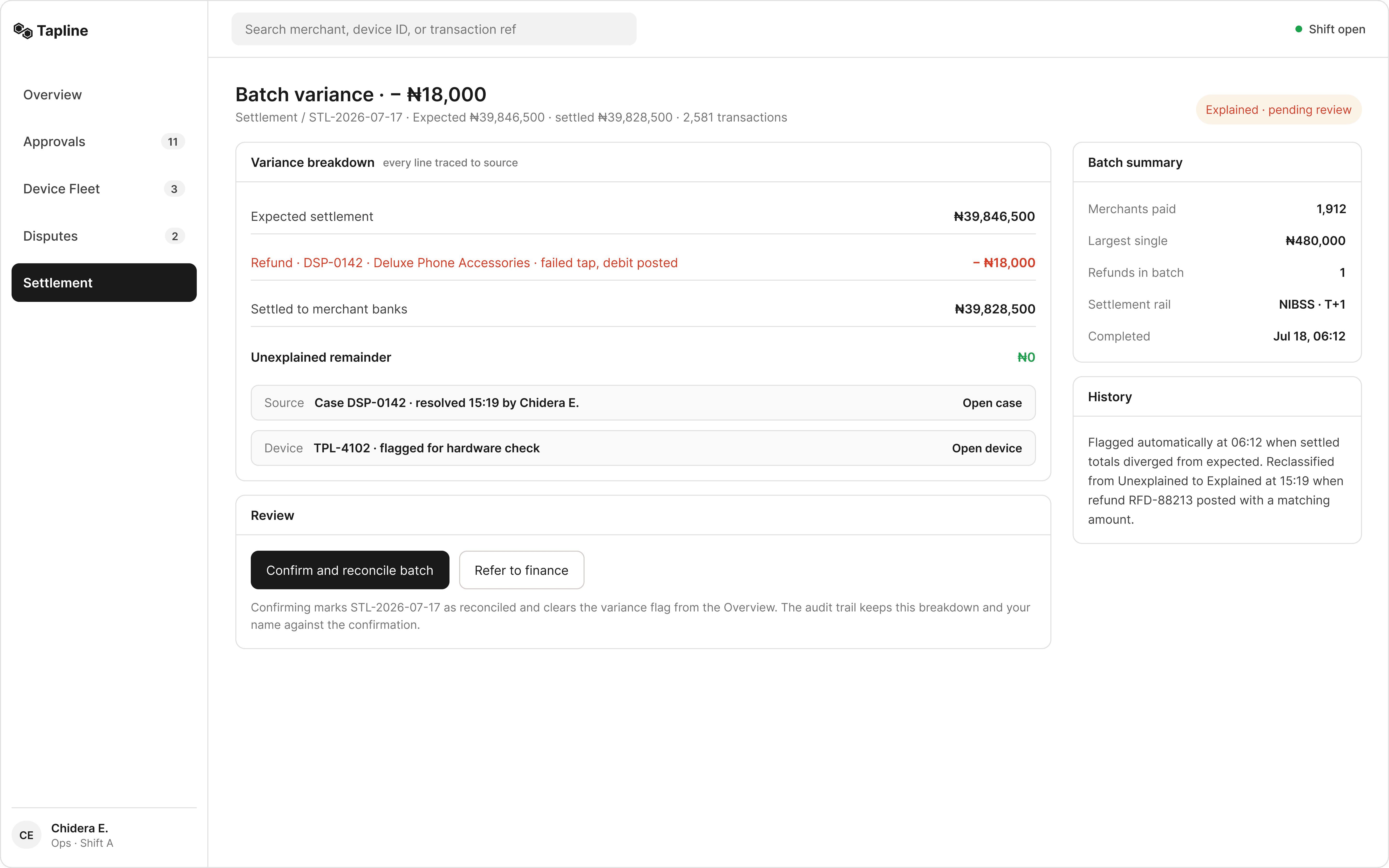
The system reclassified the variance on its own the moment the refund posted, and the history panel says so with a timestamp. An agent reading that line learns the deepest thing about this console: the four modules are one ledger wearing four faces.
Tapline is a self initiated concept study. The company is fictional. The market conditions, the failure modes, and the operational logic are not. Every figure, merchant, device, and transaction shown is fabricated to demonstrate an end to end approach to an ambiguous B2B operations problem.
Read more of my case studies


