Coog
Where AI meets the hiring process and the website finally had to prove it

Jefferson Nnaji on

B2B
AI
Overview
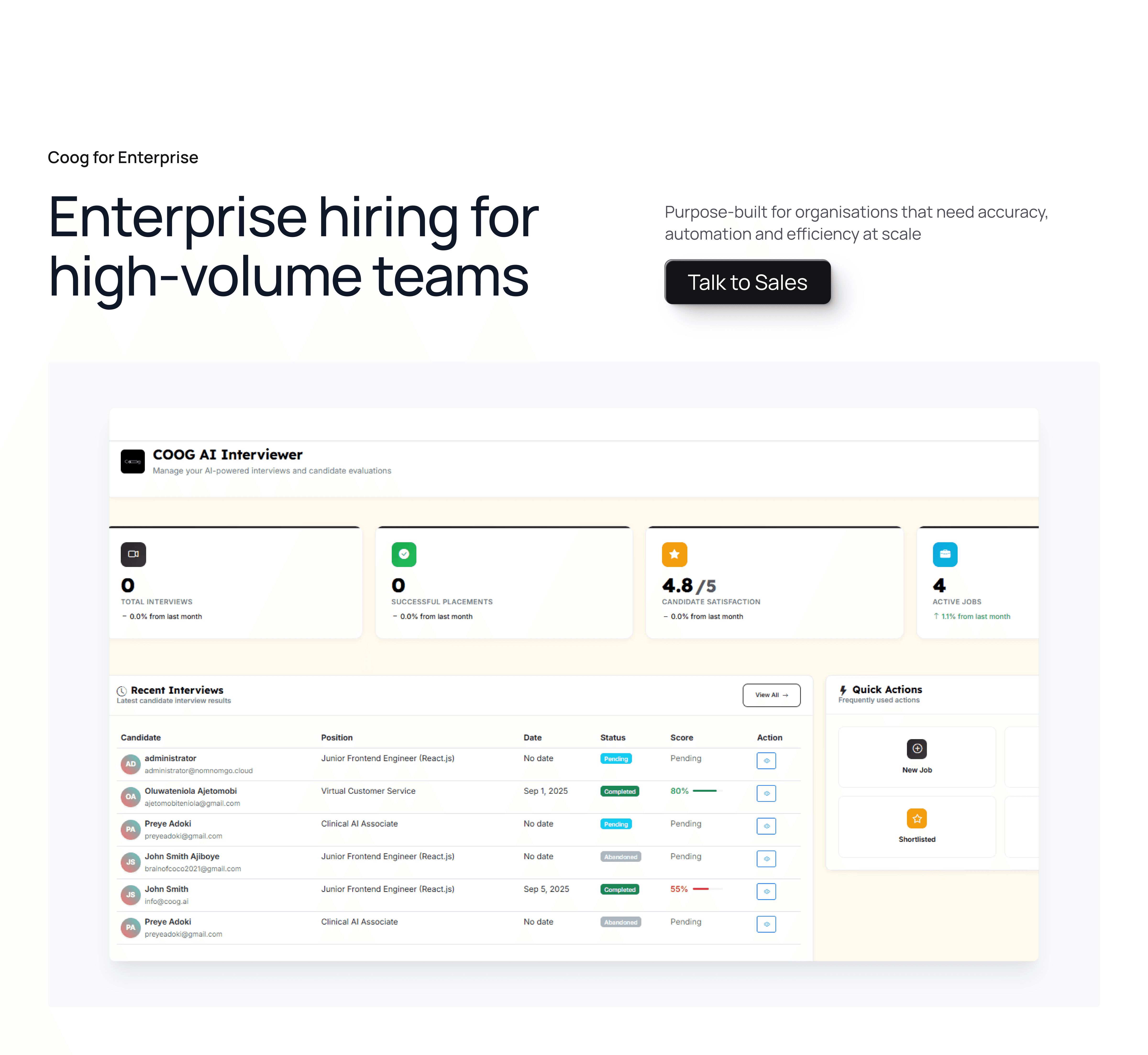
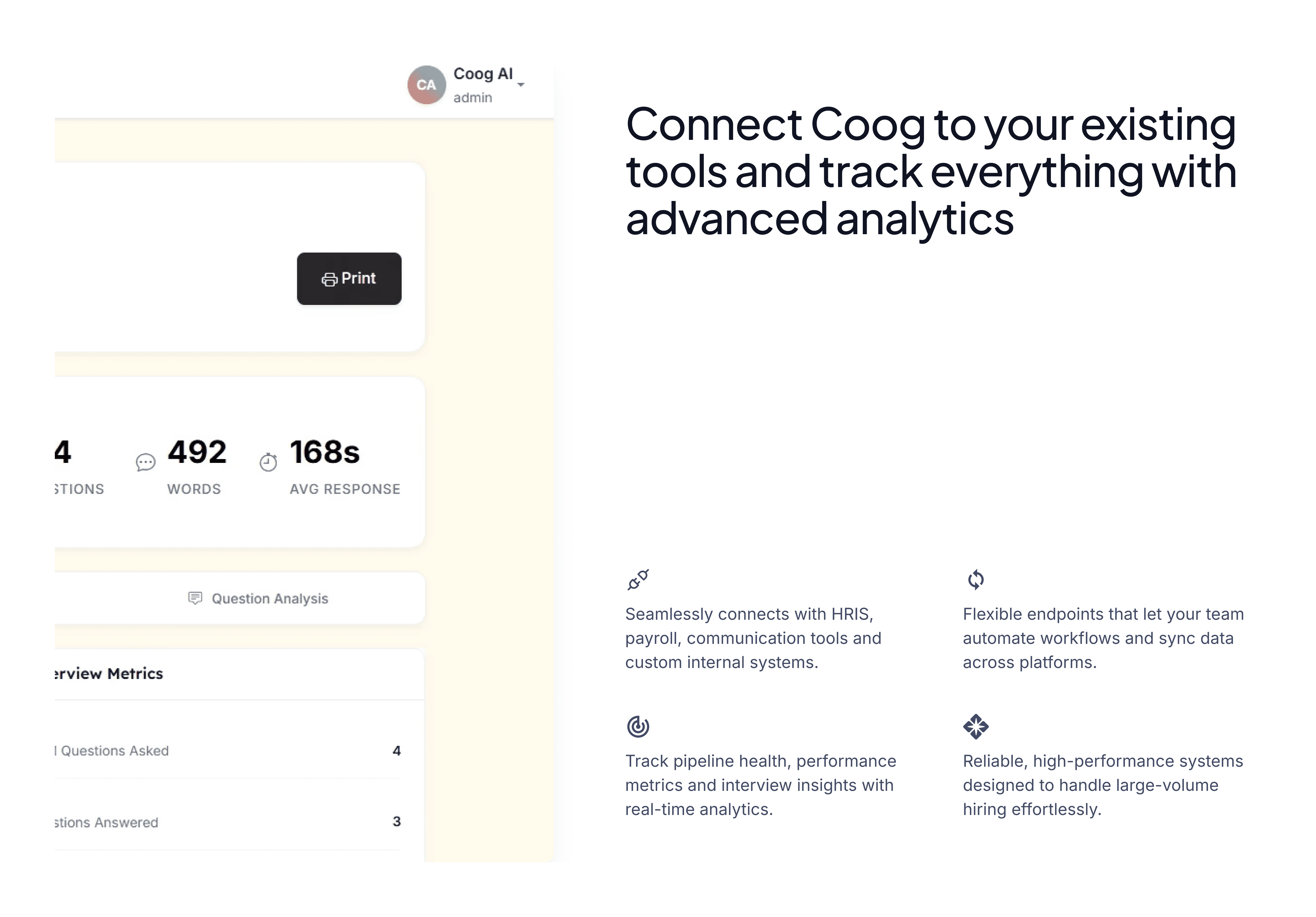
Coog.ai is an AI hiring platform that automates the first stage of recruitment. A company uploads their job details, candidates apply, and an AI conducts initial interviews — delivering only the strongest candidates to the hiring team. The technology removes the most time-consuming part of hiring without removing the human judgment that matters most.
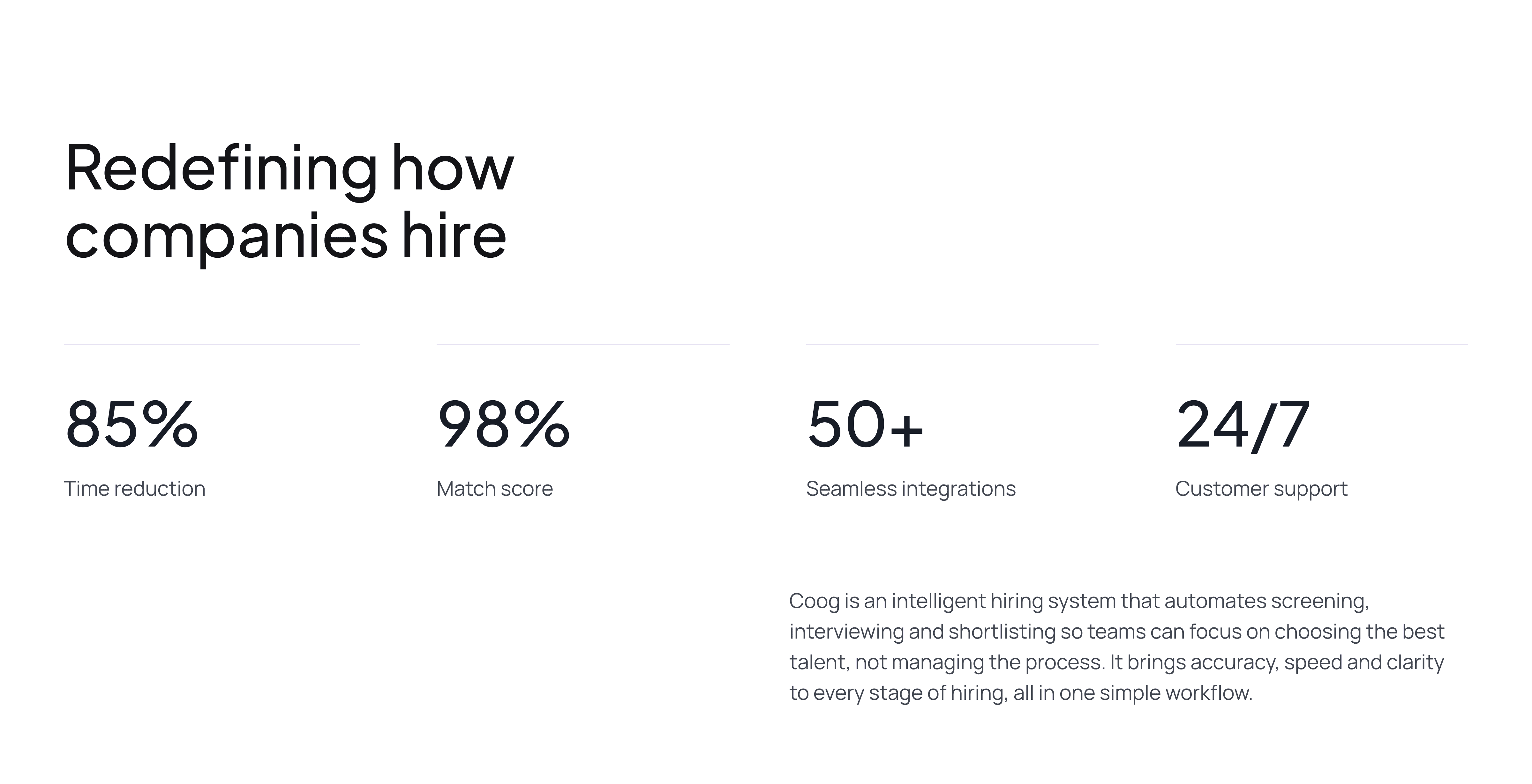
I was brought in to redesign the product website from the ground up. The previous site was failing at its one job: converting curious visitors into signups. When I joined, daily traffic sat below a hundred visitors, and of the few who arrived, only around 2% were signing up. By the time the redesign launched, daily visits had grown past 3,000 — and signup conversion had risen above 20%.
Role: Sole Product Designer Scope: Website Redesign, Design System, Marketing Funnel, Social Media Graphics Platform: Web Collaborators: Product Manager, Frontend and Backend Engineers, Customer Relations
The Problem
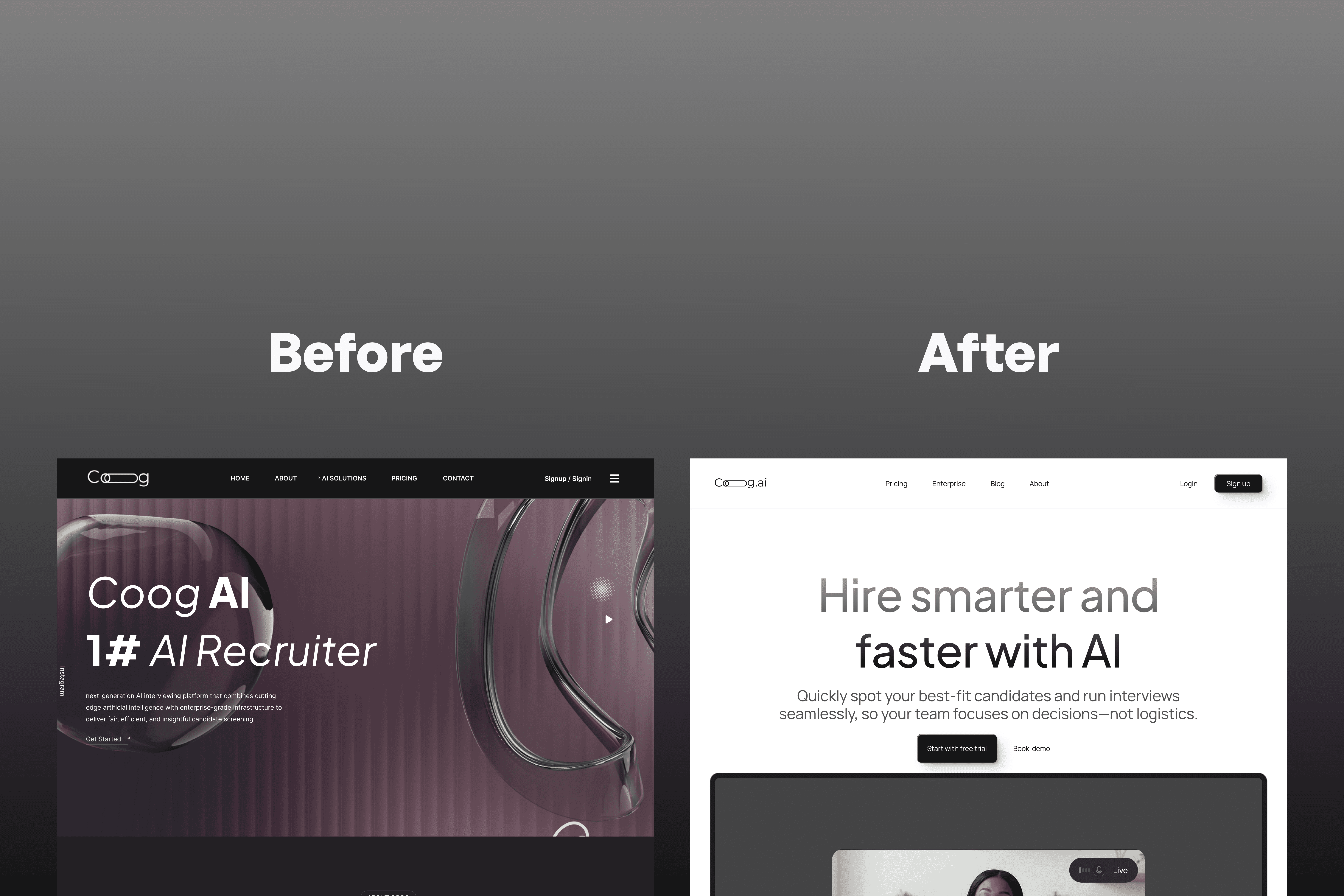
The original website was not underperforming because of a single flaw. It was underperforming because it lacked coherence. The visual inconsistencies were obvious — mismatched components, no clear hierarchy, a layout that did not direct attention — but those were symptoms. The root problem was structural: the site had no design system underneath it. Every screen had been assembled independently, which meant nothing felt trustworthy, and trust is the entire game for a product that asks companies to hand over their hiring process to an AI.
A company evaluating Coog.ai for the first time needs to answer two questions within seconds of landing on the site: do I understand what this does, and do I believe it works? The old site answered neither.
Building the Design System First
Before redesigning a single page, I built the design system. This decision was not procedural — it was diagnostic. You cannot fix a consistency problem by making better-looking inconsistencies. The system had to come first.
I built it end-to-end in Figma: design tokens covering color, typography, spacing, and elevation; a component library built on those tokens with documented variants and usage logic; and documentation written so that the frontend engineers could implement without friction and future design work — mine or anyone else's — would stay coherent.
The system paid dividends immediately. Social media graphics, landing pages, and product screens all pulled from the same source of truth. When a color decision changed, it changed everywhere. The inconsistency that had made the original site feel unfinished became structurally impossible.
The Redesign
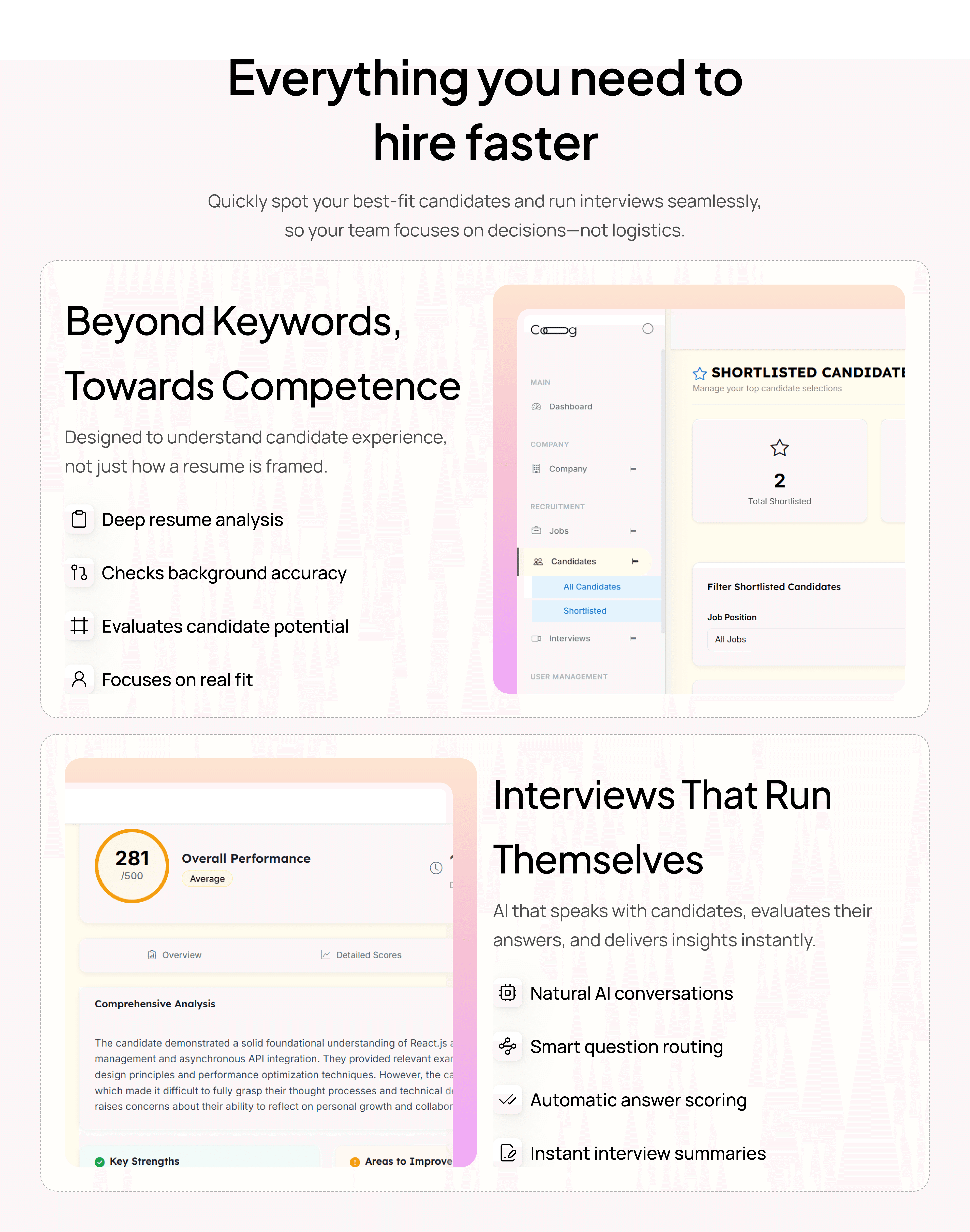
With the system in place, the redesign was about clarity and conversion. The marketing site's job is persuasion in sequence: get the visitor to understand the product, believe in it, and act. Most marketing sites fail because they try to explain too much too fast, or they lead with features when they should be leading with the problem the product solves.
I restructured the information architecture around the hiring manager's perspective — their frustration with volume, their need for signal, their skepticism about AI making decisions they don't control. Every page section answered a question that a real evaluator would be carrying.
I built and shipped the site directly in Framer. This mattered. Building in Framer meant the layout behavior, responsive breakpoints, and interaction details were mine to control — no fidelity was lost in a developer handoff, no design decision quietly rounded off in translation.
Working alongside the customer relations lead shaped the copy framing. Understanding how prospects were actually talking about their hiring problems — the specific language, the recurring objections — informed how we wrote the site, not just how we designed it.
The Results
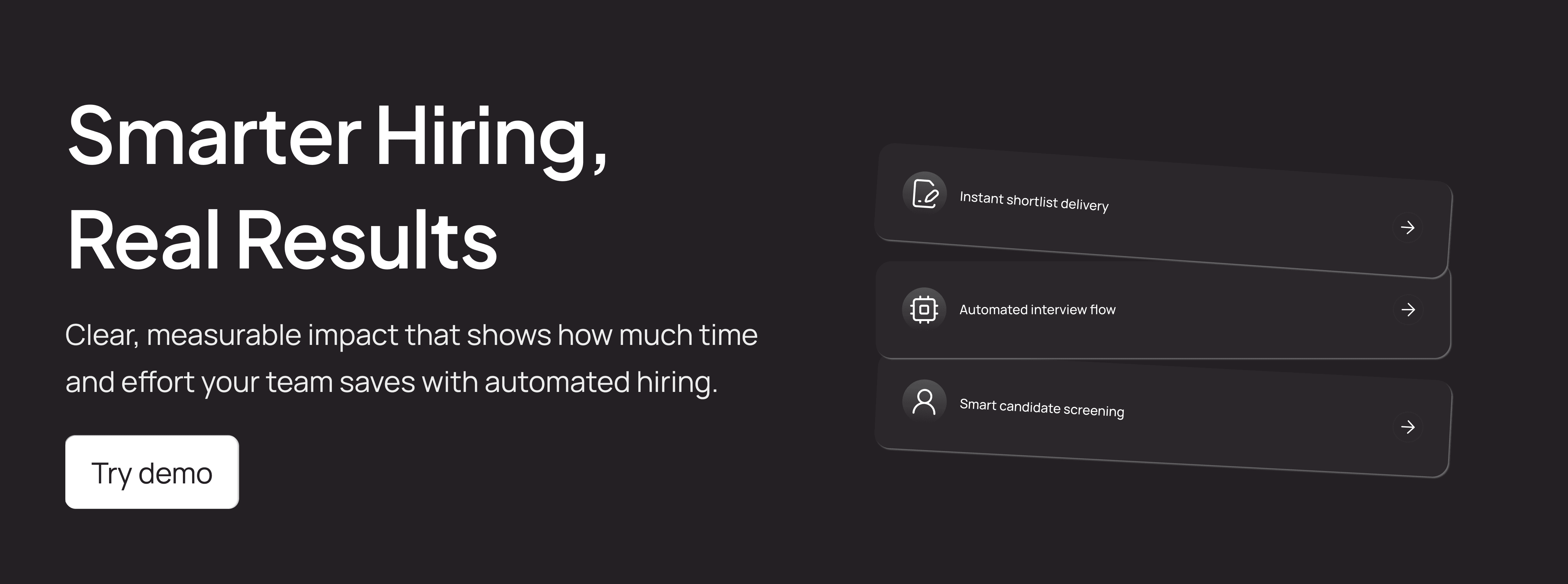
Daily visits grew from under 100 to over 3,000. Signup conversion went from approximately 2% to above 20%. Both the redesign and the marketing push contributed — the traffic growth was a combined effort, the conversion improvement was design-driven. A better-looking site does not move conversion from 2% to 20%. A site that builds trust and directs attention does.
What I Learned
This project confirmed something I had suspected but not yet seen at this scale: design systems are not infrastructure for teams, they are infrastructure for trust. The inconsistency in the original site was not just an aesthetic problem — it was a credibility problem. Users could feel that the product had not been thought through carefully, even if they could not name what they were responding to. Fixing the structure fixed the feeling.