Spry
Making personal finance feel simple, fast, and intuitive
Client:
Personal project
Type:
Case Study/Web
Role:
Product Design + Framer No-Code Development

Why I Designed Spry
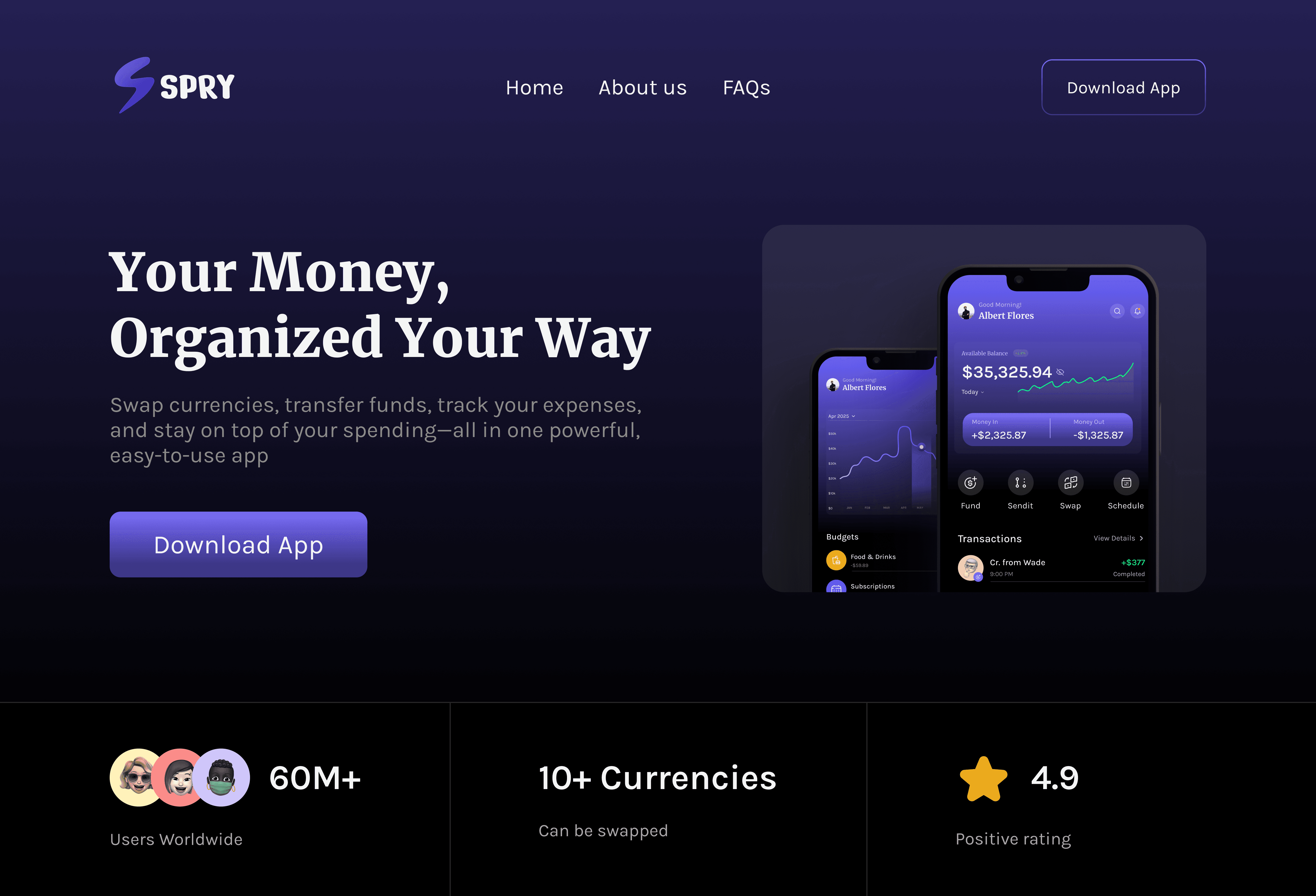
Spry was born out of a desire to simplify how people manage their money in a fast-paced digital world. I set out to design a modern budgeting app that not only tracks expenses but also empowers users to transfer funds, withdraw instantly, and even swap currencies—all from a clean, intuitive interface. The goal was to blend functionality with clarity, giving users full control and visibility over their finances.
Challenges I Faced
One of the main challenges I encountered was balancing data-heavy screens (like transactions and budgets) with a visually clean layout that wouldn’t overwhelm users. Managing hierarchy and visual clarity, especially in dark mode, took a few iterations.
Another challenge was designing seamless interactions for actions like sending money or swapping currencies—making them feel fast, safe, and intuitive. I had to rethink traditional form patterns to minimize steps and reduce friction.
Lastly, designing for real-time updates and transaction states (like completed vs. failed transactions) required careful attention to microstates and color usage for clarity and accessibility.
How I Overcame Them
I overcame these challenges by:
Using consistent iconography and subtle color variations to create distinction between transaction types and statuses.
Implementing a modular layout system to keep everything aligned and scalable.
Relying on feedback from peers and real user behaviors to refine flows and UX decisions.
Testing out motion and transitions in Framer, which helped bring the interface to life and added fluidity to the user experience.
What I Loved
It was especially fun exploring Framer animations to make the landing page more engaging. The live chart animations and smooth scroll interactions made the experience feel dynamic and modern—exactly how I envisioned Spry.