PRODUCT DESIGN CASE STUDY · 2026
The medication
nobody remembered
to take
Hoiva is a medication companion built for the Nigerian market. This is the story of why it exists, what I discovered designing it, and the decisions I made that I would make again.
ROLE
Product Designer · Solo
PLATFORM
iOS · Android
MARKET
Nigeria · Primary

01
How a pharmacy counter changed what I thought I knew
My parents have had high blood pressure for as long as I can remember. Growing up, I watched them take their medications every morning. Amlodipine, sometimes three or four tablets, laid out beside a glass of water before breakfast. It looked routine. It looked managed.
It was not. Life would get busy, the medications would get skipped, and nobody in the house was tracking it. By the time the symptoms returned, a blood pressure spike, a rushed hospital visit, a doctor asking why they had not been consistent, the damage was already done. The same conversation, repeating itself, year after year.
I assumed it was a problem specific to us. Then I studied industrial chemistry, and during my NYSC I worked at a pharmaceutical company. I stood behind a pharmacy counter and watched it play out with strangers. Patients asking whether we had anything they only needed to take once a day. Not because their doctor had prescribed something wrong. Because they could not keep up with twice or three times daily. They were missing doses and quietly trying to engineer around it, choosing simpler schedules rather than solving the actual problem.
I had seen this at home. I was now watching it repeat at scale, with different people, in the same country, for the same reasons. This was not a personal failing. It was a systemic gap that nobody had designed a serious solution for.


02
Who I was actually designing for
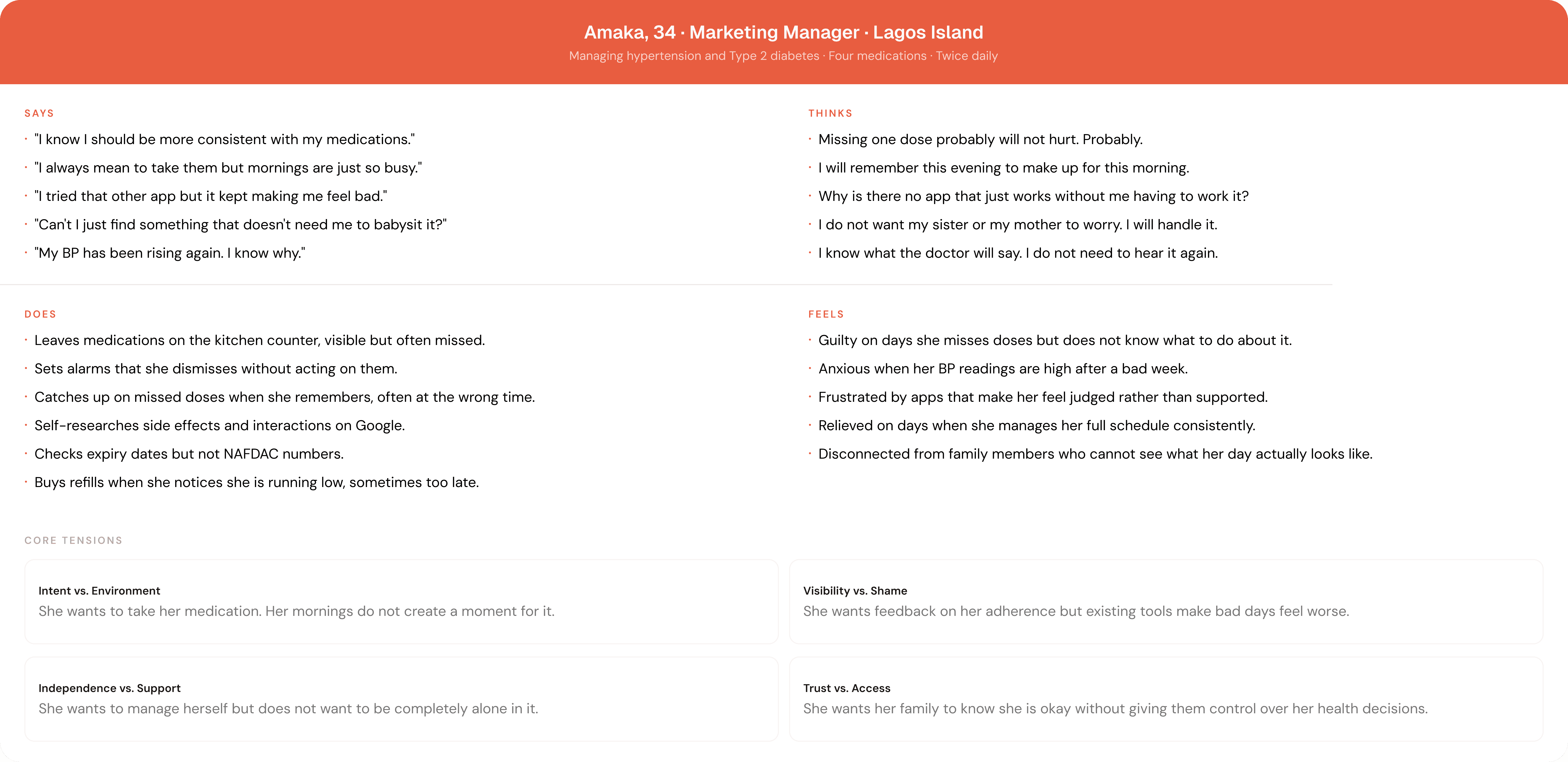
I defined four user types. But I want to be honest about how I used them. Amaka is the primary user. Every core design decision was pressure-tested against her life. The other three shaped edge cases and secondary flows but they did not drive the product.

03
What the research forced me to confront
I mapped eight pain points from personal observation, pharmacy conversations, and research into medication adherence across Nigeria and West Africa. These shaped everything that came after.


Sitemap
04
Three decisions I made that I would make again
Most design decisions are obvious in retrospect. The right spacing, the predictable hierarchy, the standard component behaviour. I am not listing those. These three had clear alternatives that a different designer would have chosen. I want to explain why I went the other way.
COLOR
Coral instead of blue
Healthcare design has a color problem. Blue is everywhere, and every app using it is saying the same thing: clinical, precise, trustworthy. Open the top ten health apps on the App Store and most of them open with a cool blue that communicates the same emotional register. They are telling you this is serious and this is medical.
Hoiva needed to say something different. Not because clinical is wrong for healthcare, but because it is wrong for this product and this user. Amaka is not opening a hospital portal. She is doing something intimate and recurring, multiple times a day, in her kitchen or her office or the back of a danfo. The app needed to feel like it belonged in those spaces.
Coral sits at the boundary between red and orange. Psychologically it carries warmth and approachability without the urgency of red or the high energy of saturated orange. It reads like the colour of a kitchen wall, a ceramic bowl, something domestic that has been in the room for years and feels right there. That was the register I was looking for: not a product that commands attention but one that earns comfort over time. Something that, when Amaka opens it first thing in the morning, feels like it belongs in her day.
Pattern-breaking in a crowded category is also a signal in itself. When a user opens Hoiva and does not see blue, they register that this product made a deliberate choice. That first-impression differentiation carries weight in a market where most products look identical within five seconds of launching.
METRIC REMOVAL
No progress score. No streak. No "3 of 5 done today."
Early designs included a summary pill at the top of the Today screen showing doses taken versus scheduled. It looked clean. It communicated daily progress at a glance. I removed it before any user saw it.
The reason comes down to what that number does to someone on a bad day. A user who missed two doses because they were in back-to-back meetings does not need to open their app and see "1 of 5 done." They already know. They already feel it. Attaching a number to that feeling is not accountability. It is shame dressed up as data.
The research is consistent on this: health apps that use progress metrics as achievement signals see higher early engagement and faster abandonment. Users stop opening the app not because it stopped working but because opening it started to feel bad. For a product whose entire value depends on being opened daily, that is a fatal design decision disguised as a feature.
In Hoiva, taken doses sink to the bottom of the Today screen, greyed out but still visible. The user can see what they did without a score telling them how to feel about it. The information is present. The judgment is not. That distinction is the whole decision.
NOTIFICATION TIMING
Asking for permission after commitment, not before value
The conventional pattern is to request notification permission during onboarding, often within the first two screens, before the user has done anything inside the product. The logic makes surface sense: notifications are central to the value, so ask early.
The problem is that early asking is asking without trust. The user has given nothing yet. They have no evidence that the product understands their schedule or that its reminders will be worth receiving. Asking them to hand over access before they have experienced a single useful thing is asking for trust that has not been earned.
Apps that defer permission prompts until after the user experiences core value see meaningfully higher grant rates than those that ask upfront. The psychological mechanism is reciprocity. Once a product has done something useful for a person, that person is more willing to give something back. Hoiva asks for notification permission after the user has named themselves, told the app what they are managing, and saved their first medication. By that point they understand exactly what they are allowing and why it matters to them specifically.
There is a second layer specific to the Nigerian Android context. Tecno and Infinix phones, the dominant mid-range handsets in the market, both include power management systems that kill background apps and suppress notifications by default regardless of whether system permission is granted. If the user's OEM battery whitelist does not include Hoiva, the reminders will not arrive reliably. Hoiva addresses this with device-specific onboarding instructions shown per manufacturer, walking users through exactly which settings to change. This is not a disclaimer buried in a help doc. It is a product decision that makes the core feature actually work for the user it was built for.

05
Three flows that carry the whole product
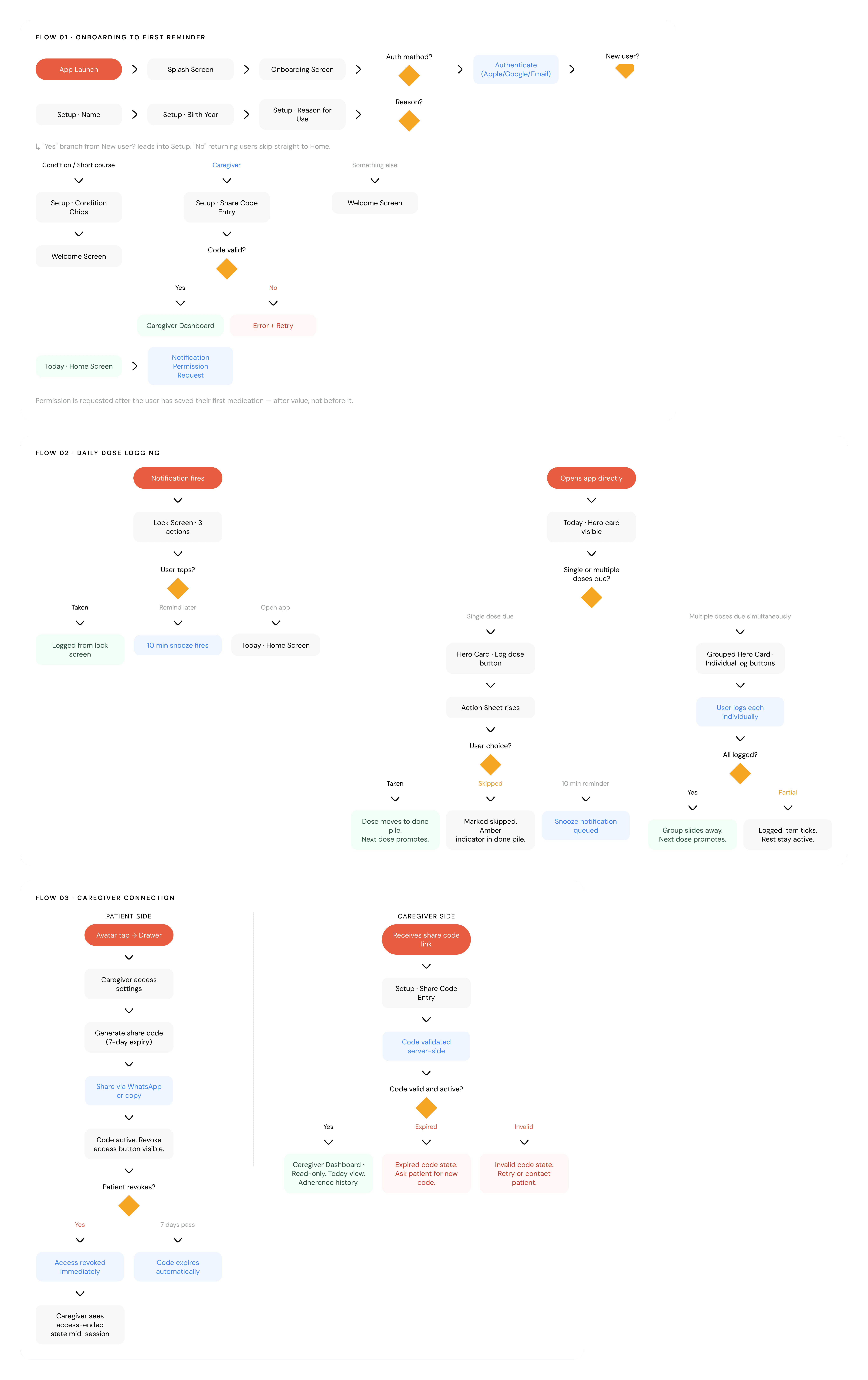
I designed eight user flows in total. These three reveal the most about how Hoiva thinks about the user. The rest are supporting flows: medication editing, notification settings, prescription management. Important, but not the argument.
Onboarding to First Reminder
he onboarding flow collapses to one screen. One headline, a live preview of a populated home screen, and three auth options. No carousel. No three-screen value proposition. No feature list. A user who opens Hoiva already knows they need a medication companion. They do not need persuading. They need to get inside the product.
Post-auth, a six-screen setup flow collects the user's name, birth year, reason for use, conditions, and an optional caregiver share code. Everything collected is used immediately. Nothing is stored speculatively. The first reminder is scheduled the moment the user saves their first medication. The onboarding ends not with a tour but with a populated screen that already belongs to them.

Daily Dose Logging
The core daily loop. The next due dose sits as a hero card at the top of the Today screen. The user taps Log dose, an action sheet rises, they confirm, and the card transitions with a slide-up animation. The taken dose moves to the bottom of the screen, greyed and timestamped but still visible. The next upcoming dose promotes itself into the hero position.
When two medications are due simultaneously, they appear as a grouped hero card with individual log buttons per medication. When both are logged, the group slides away and the next upcoming dose promotes. The screen never clears dramatically. Taken doses stay visible at the bottom because their presence matters: the user should be able to see what they did today without navigating anywhere.

Caregiver Connection
Sade, in Abuja, needs to know that her parents took their medication this morning. The caregiver flow gives her that: a share code the patient generates, sent via WhatsApp, that grants read-only access to the caregiver dashboard for seven days.
The boundaries are deliberate. Read-only. Time-limited. Instantly revocable. And when revocation happens mid-session, the caregiver sees a clear, respectful message that their access has ended, not a broken screen. That moment, rare as it may be, tells the user everything about what kind of product they are dealing with. Products that handle edge cases gracefully are products that have thought seriously about the people using them.

06
What I would do differently, and what I do not yet know
Every product has unresolved questions. Pretending otherwise is not confidence. It is dishonesty. These are the three things I would handle differently or test before this went to production.
Three honest open questions
The caregiver model assumes consent is stable.
The current design handles revocation but does not handle the messier reality: what happens when the patient did not fully understand what they were consenting to, or when the caregiver uses visibility in ways the patient did not anticipate? In families where chronic illness creates power dynamics, these are not edge cases. The product needs a consent model that is ongoing, not granted once at setup and forgotten.
The AI scanner is only as good as its underlying data.
The Nigerian drug database is incomplete and inconsistently maintained. A scanner that confidently identifies Emzor Metformin but draws a blank on a regional generic creates a worse problem than no scanner, because an unexplained blank reads as suspicious when the drug is fine. The data quality problem has to be solved before the feature can be trusted at scale.
The OEM notification fix has not been tested in the field.
The per-manufacturer battery whitelist onboarding is the right solution on paper. Whether a 58-year-old with low digital literacy successfully navigates five steps into their Tecno settings is a question a Figma file cannot answer. That flow needs real users, in real conditions, before it can be called solved.
Read more of my case studies


