Sabi
A cross-platform mobile app that gives Nigerian professionals a unified, intelligent view of their spending across multiple bank accounts.

Jefferson Nnaji on

Fintech
Mobile app
Overview
Sabi is a cross-platform mobile app designed to help Nigerian professionals understand their spending across multiple bank accounts.
This project explores a gap in the Nigerian fintech ecosystem: while users can access their financial data, they lack the tools to interpret it meaningfully.
I designed the product end-to-end, focusing on how financial information can be presented in a way that is clear, non-judgmental, and actionable.
Role: Product Designer (solo)
Scope: UX, UI, Product Thinking, Design System
Platform: iOS (primary), Android (secondary)
Problem
There is a recurring pattern among Nigerian professionals:
They earn consistently, yet struggle to explain where their money goes.
Most banking apps provide:
Transaction logs
Debit alerts
Basic account balances
But they fail to provide:
Context
Patterns
Insight
Users are left to manually piece together their financial behavior across multiple apps.
Through early conversations, one pattern became clear:
Users are not irresponsible with money. They are operating without visibility.
This distinction reframed the problem entirely.
Opportunity
The Nigerian fintech space has strong players in:
Payments (Moniepoint, Flutterwave)
Savings and investments (PiggyVest, Cowrywise)
However, there is no dominant product focused on:
Helping users understand their spending behavior
This presents an opportunity to build a product that sits between banking and financial planning—a clarity layer.
Research
I conducted qualitative interviews with Nigerian professionals aged 24–33, earning between ₦250k–₦600k monthly.
To test financial awareness:
Participants estimated their monthly spending
Then compared it with actual transaction history
Key Findings
Most users underestimated spending by 2× or more
Spending was fragmented across multiple accounts
Users frequently checked balances due to uncertainty
Budgeting tools were abandoned due to friction and poor localization
The most important insight:
I’m not bad with money. I’m just blind to it.
Defining the Product
Initially, I explored common fintech directions:
Budgeting tools
Spending scores
Alerts and notifications
These approaches introduced friction or felt overly controlling.
I shifted toward a different framing:
Sabi should not tell users what to do. It should help them see clearly.
Design Principle — The Mirror Principle
The product is built on a single guiding idea:
Reflect, don’t judge
Most financial apps:
Score behavior
Highlight “bad” spending
Push corrective actions
Sabi:
Shows patterns
Provides context
Leaves decisions to the user
This principle influenced:
Copywriting
Visual system
Data representation
Feature prioritization

Information Architecture
The app is structured into five core areas:
Home → Current financial state
Transactions → Full activity log and details
Insights → Behavioral patterns
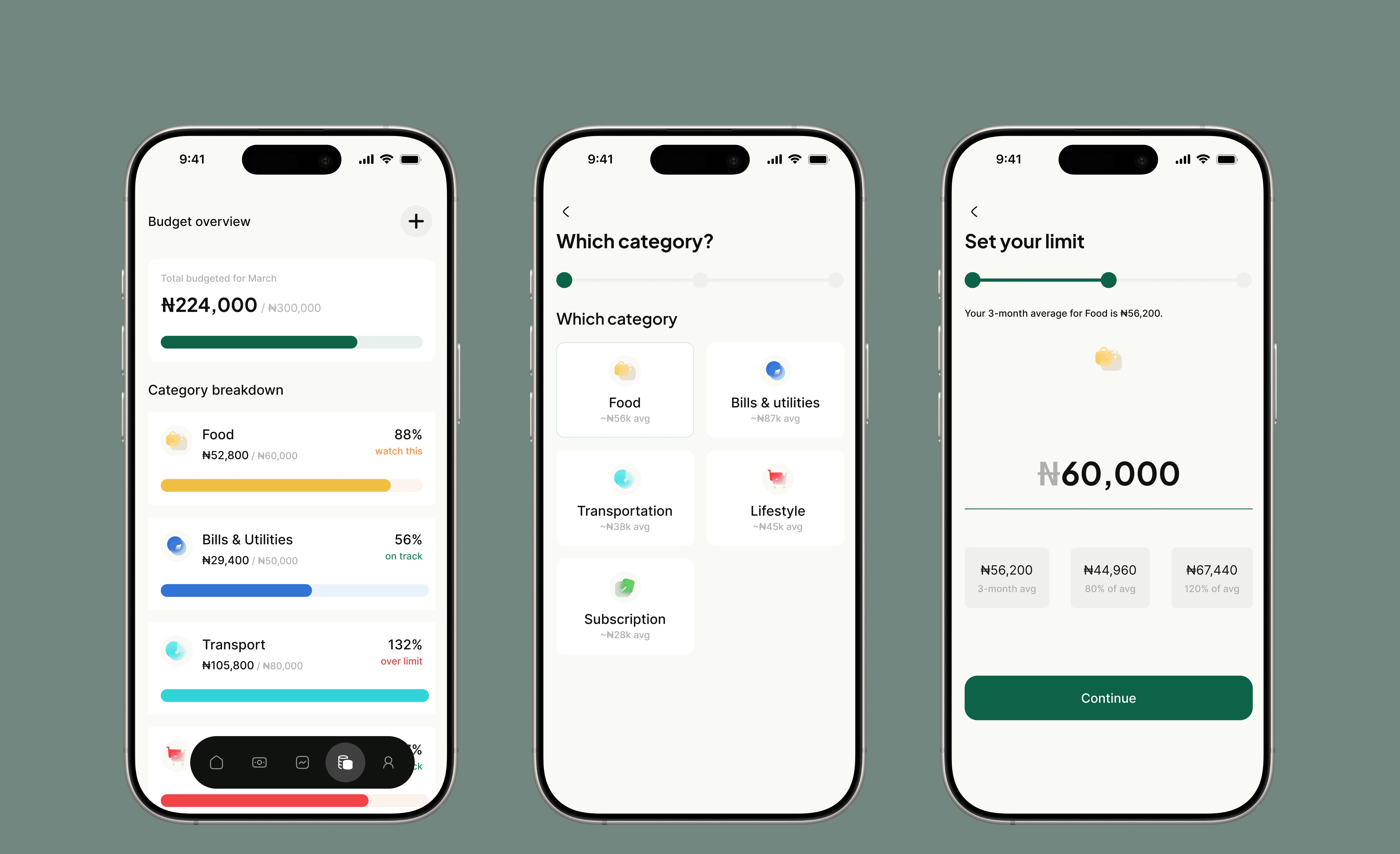
Budget → Optional spending limits
Profile → Account and settings
This structure separates:
Daily awareness
Deep analysis
Optional control
Information Architecture
The app is structured into five core areas:
Home → Current financial state
Transactions → Full activity log and details
Insights → Behavioral patterns
Budget → Optional spending limits
Profile → Account and settings
This structure separates:
Daily awareness
Deep analysis
Optional control
Key Design Decisions
1. Remove Judgment from the System
No red for overspending unless user sets a budget
No scoring or grading
No prescriptive language
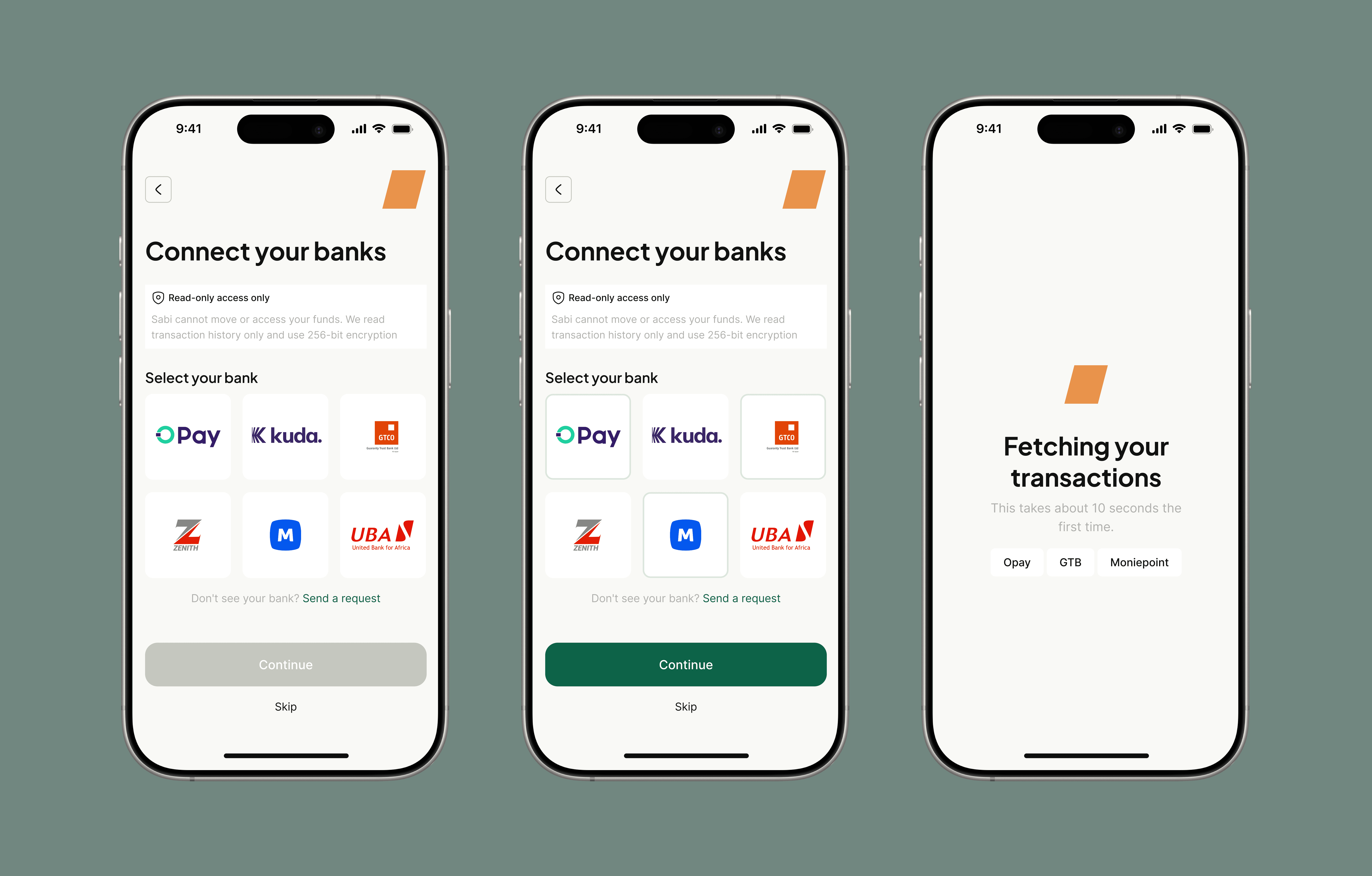
2. Design for Multi-Account Reality
Users operate across multiple banks.
The product aggregates all accounts into a single view.
3. Prioritize Single-Glance Clarity
The Home screen answers:
Where do I stand right now?
Without requiring navigation.
4. Make Insights Passive, Not Pushy
Insights are discoverable, not forced.
Users explore patterns at their own pace.
Design System
The visual system reinforces clarity and neutrality.
Typography
Plus Jakarta Sans → financial emphasis
Inter → interface readability
Color Logic
Green → lower spending
Amber → higher spending
Red → only for true errors or exceeded limits
Key rule:
Color never implies judgment unless the user defines a limit.
Key Screens
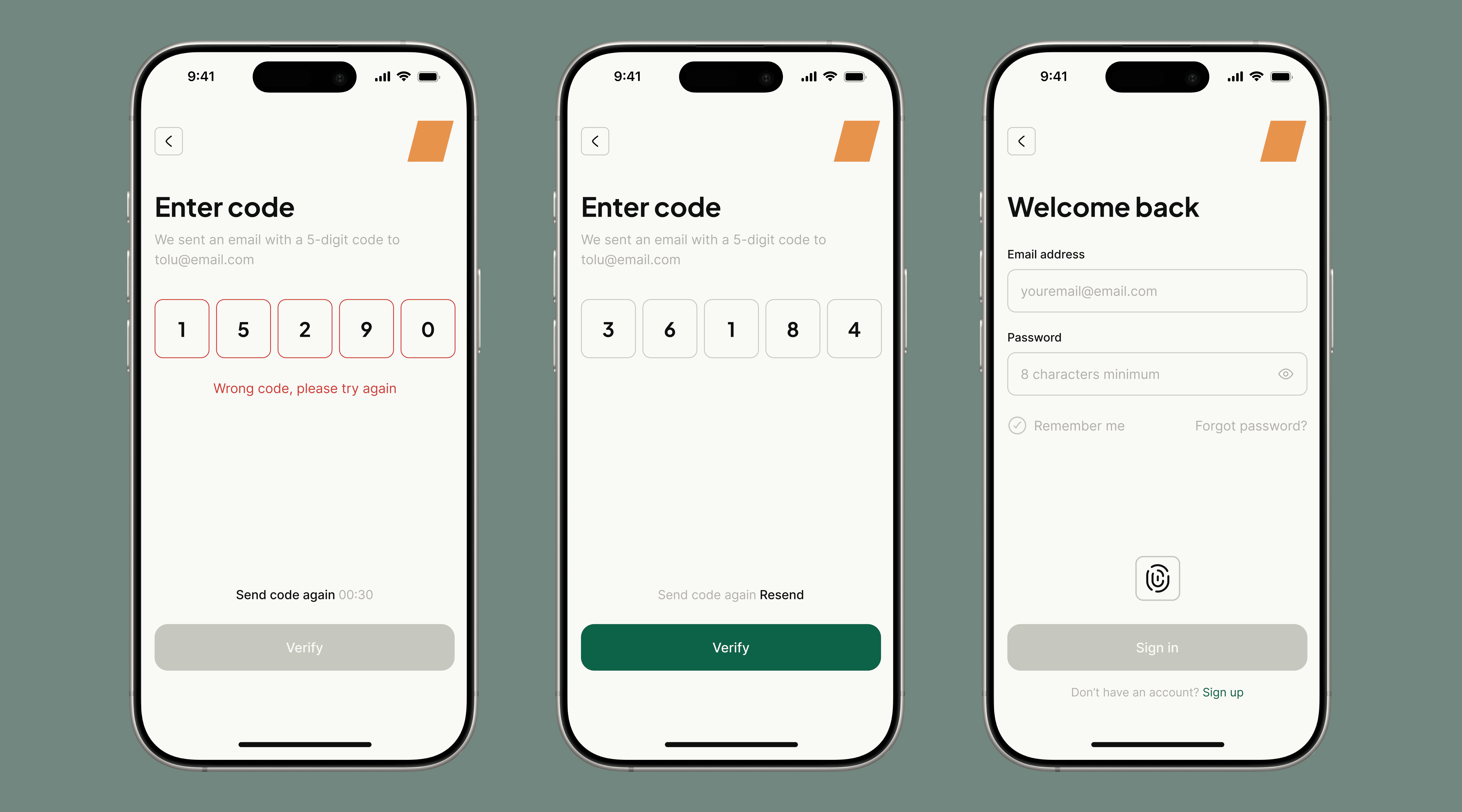
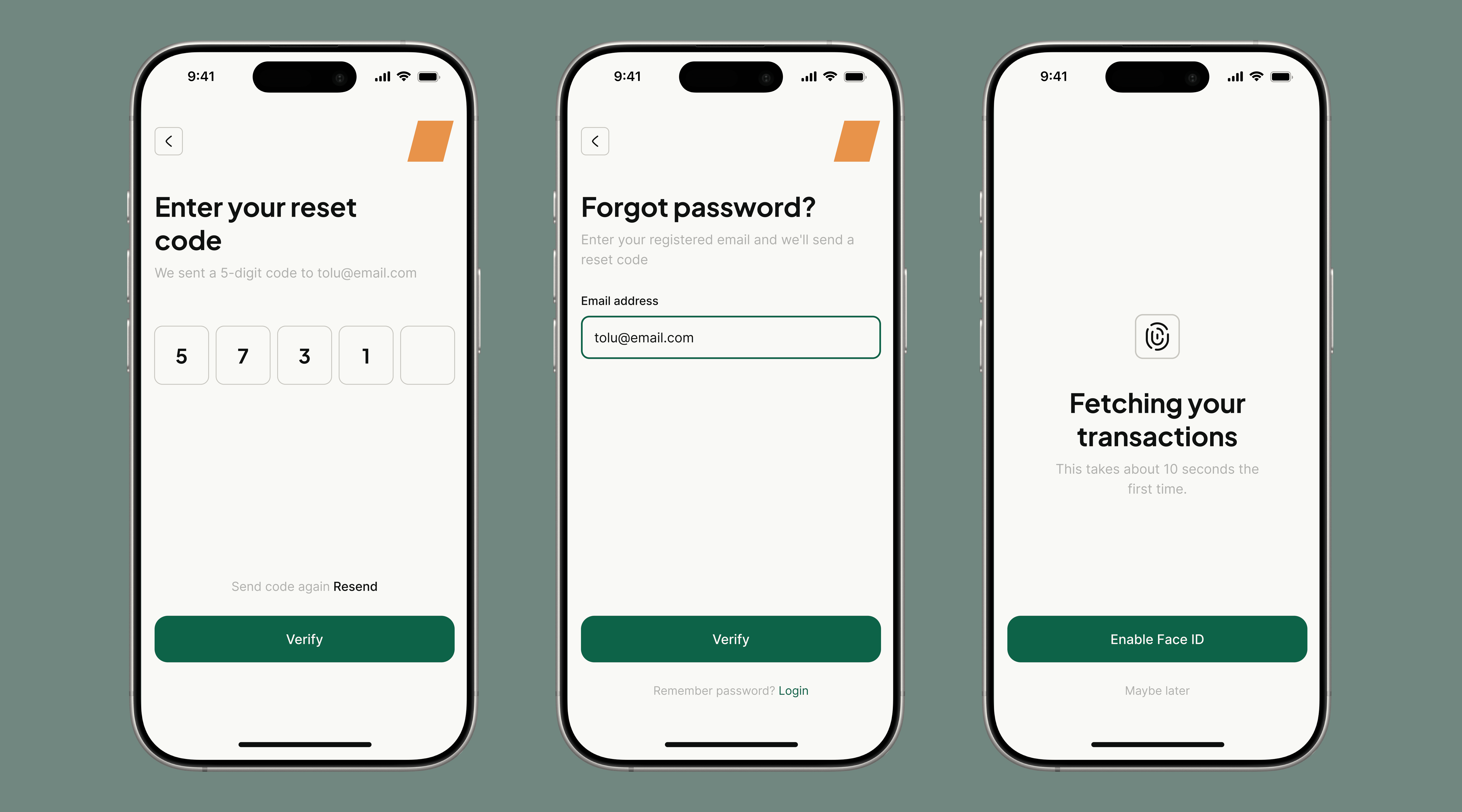
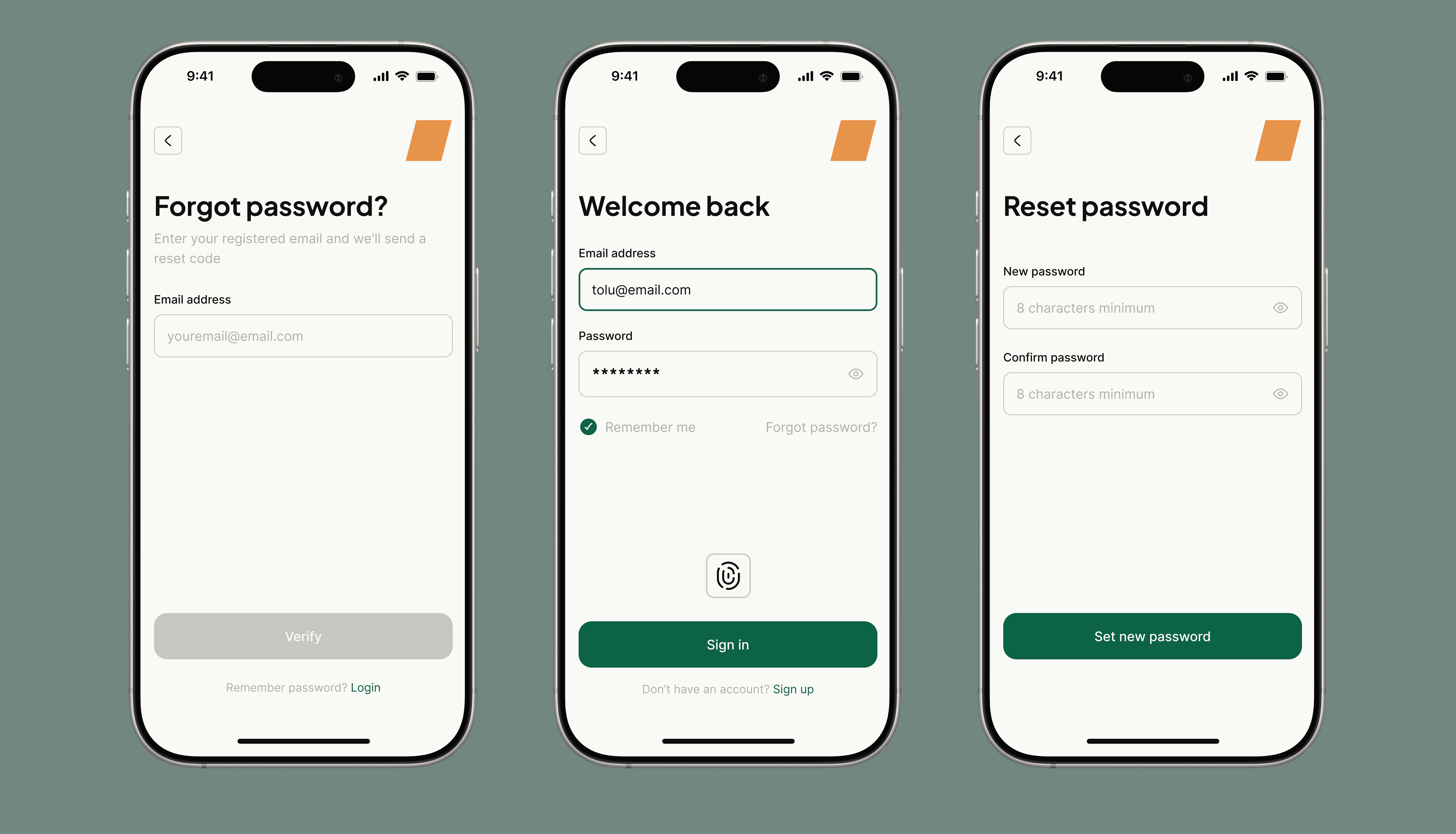
Onboarding & Bank Connection
The onboarding flow focuses on trust
Home Dashboard
The Home screen is the core experience
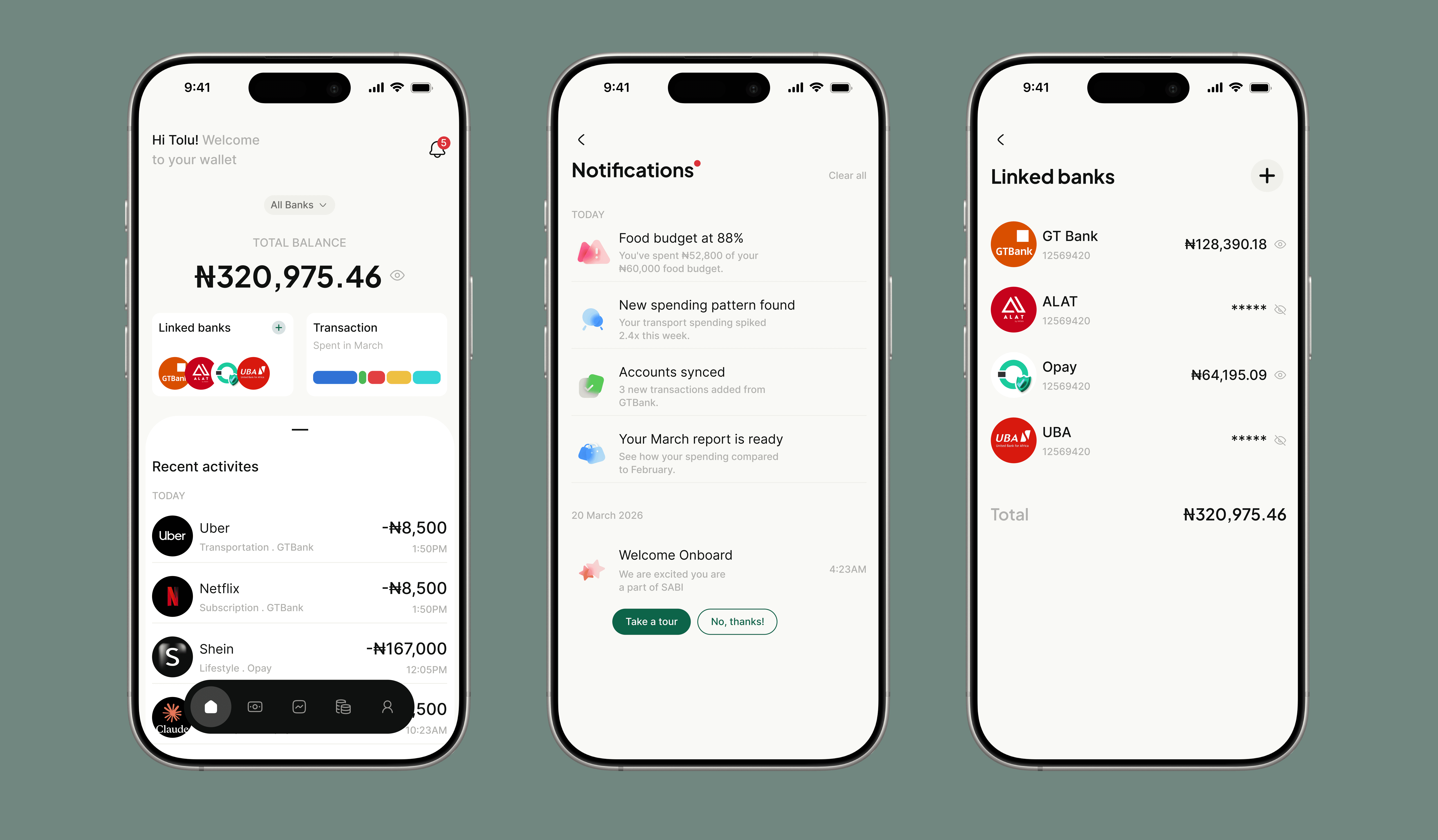
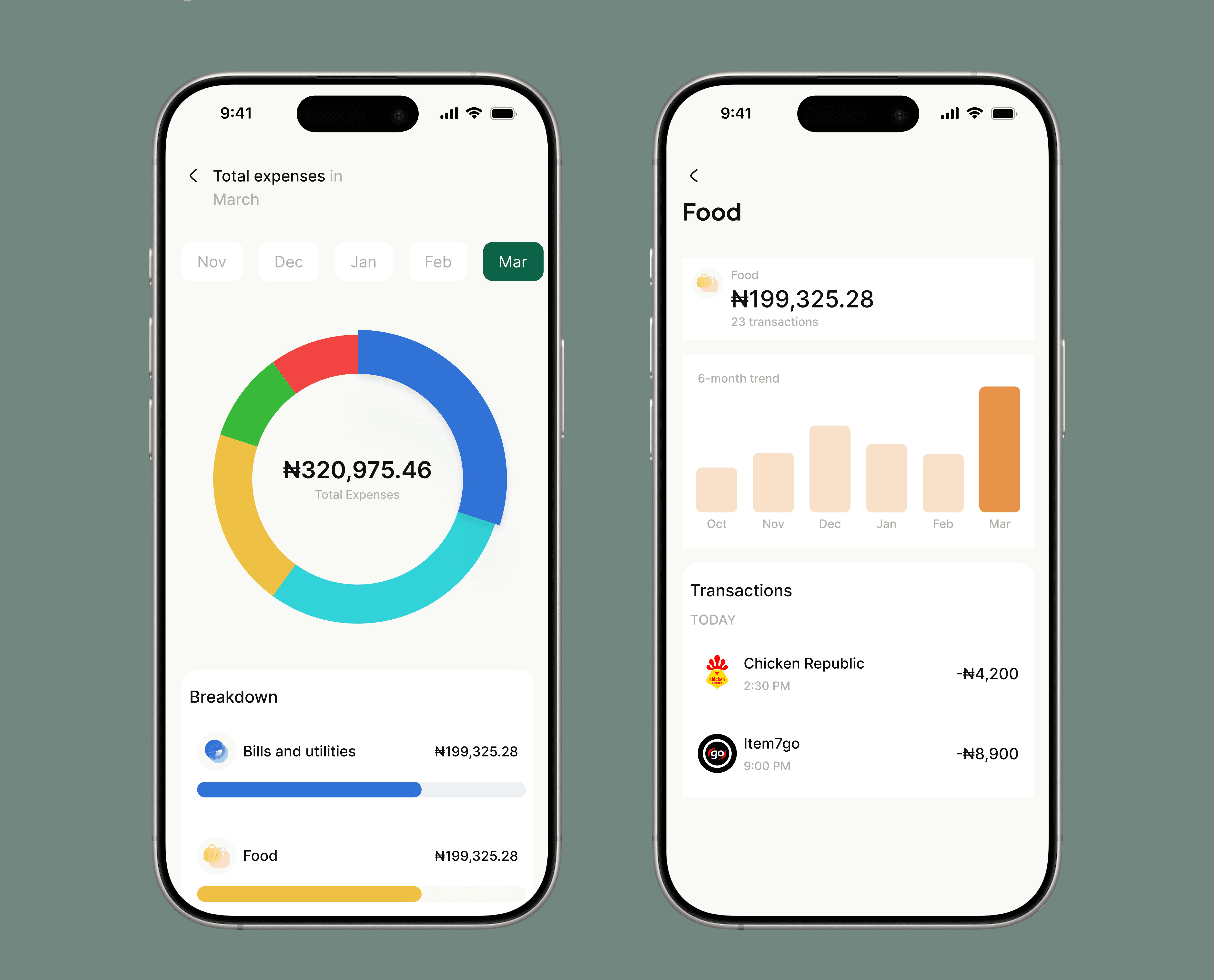
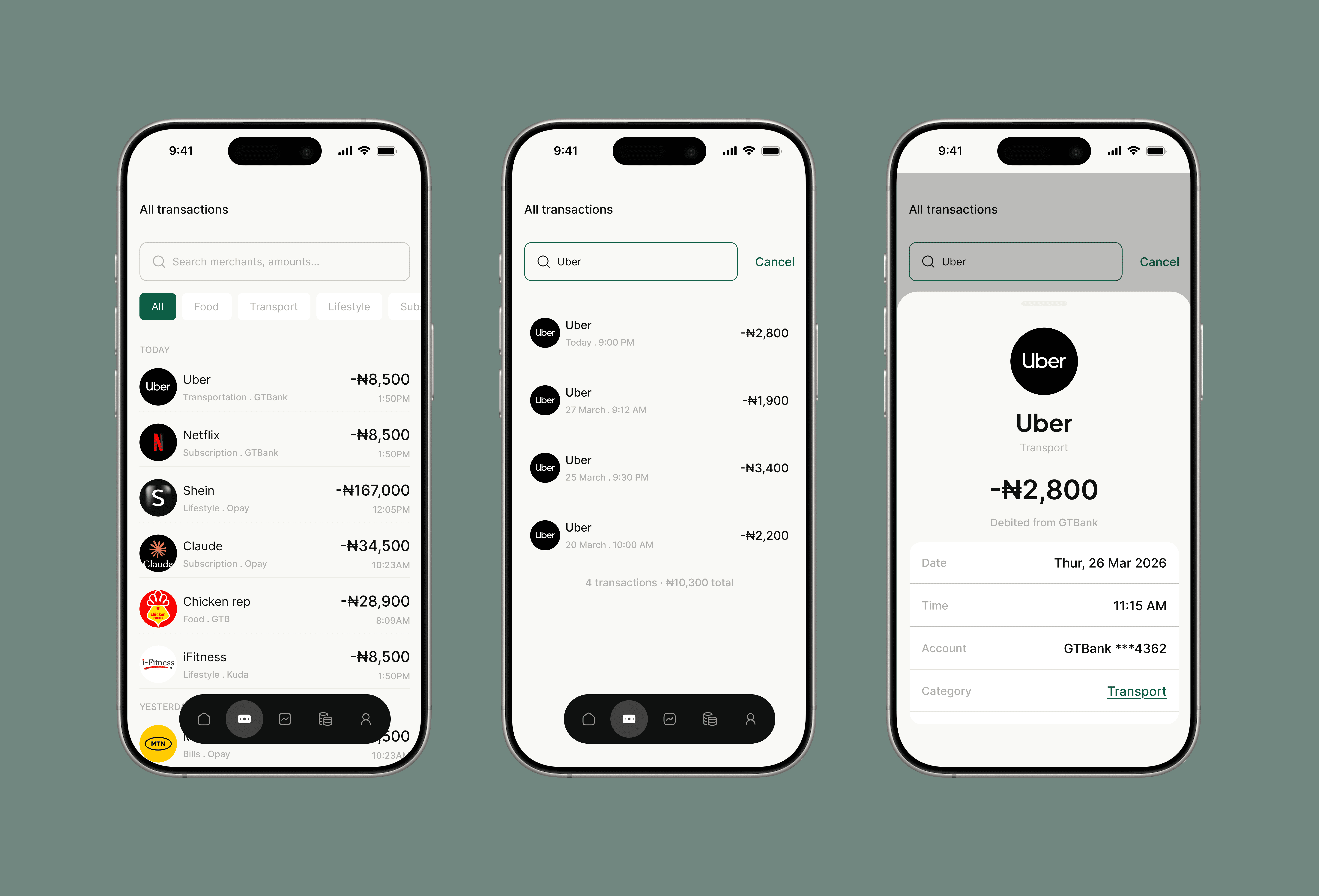
Transactions
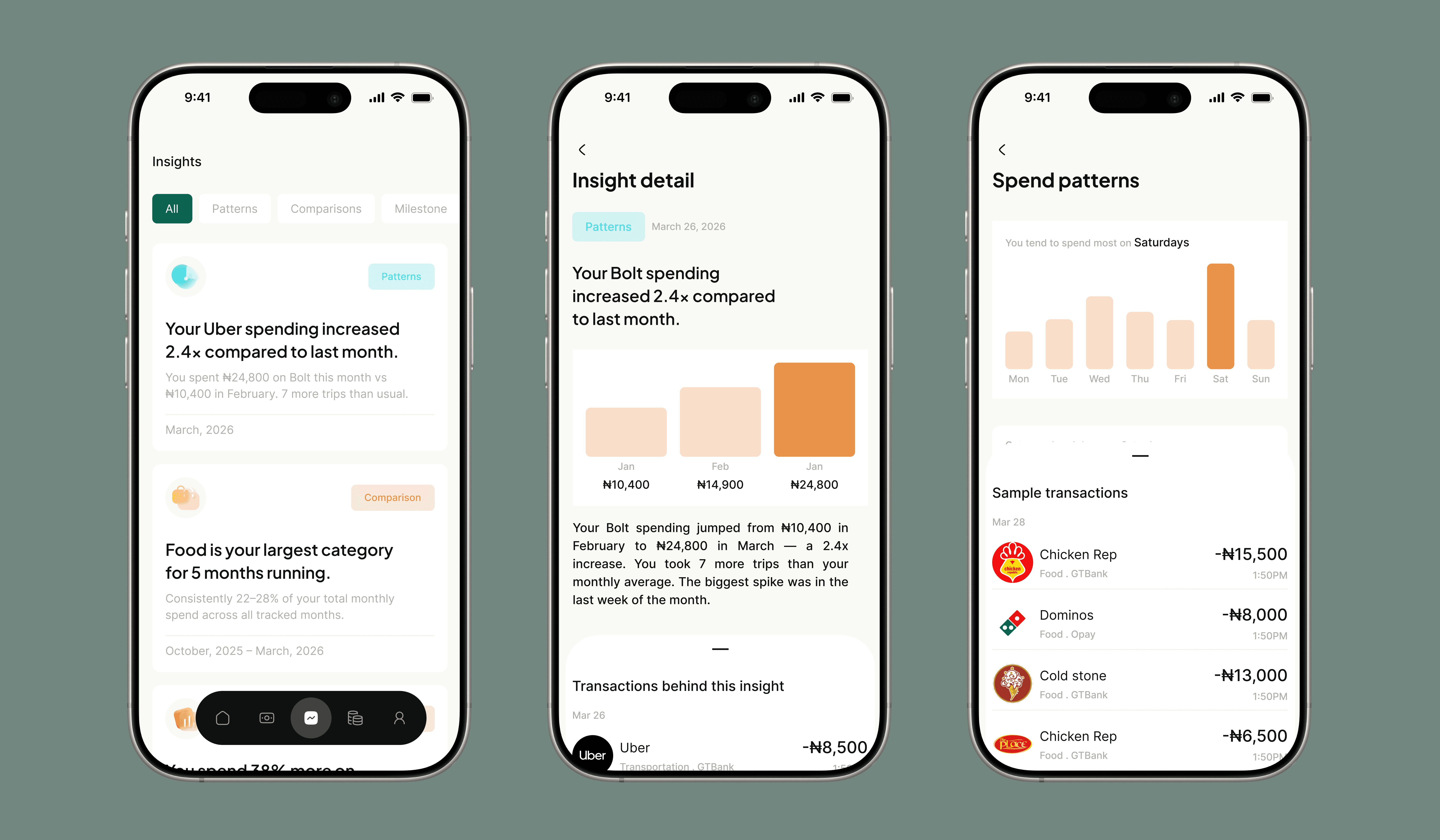
Insights
The Insights tab surfaces patterns such as:
Spending frequency changes
Category dominance
Behavioral trends
Each insight is purely observational.
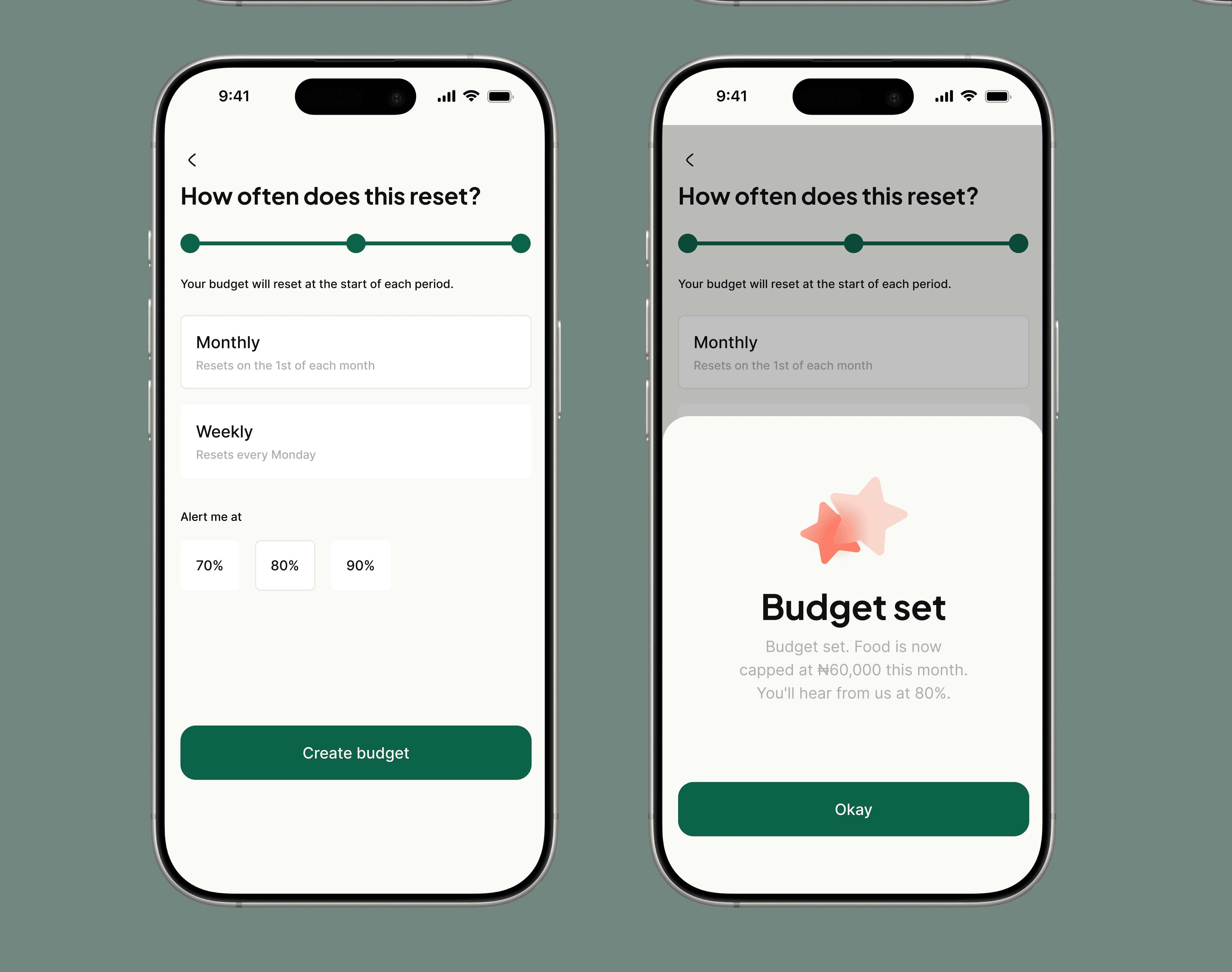
Budget
The Budget tab introduces optional control
Outcomes (Projected)
Although this is a concept project, expected outcomes include:
User Impact
Increased awareness of spending patterns
Reduced financial uncertainty
More confident decision-making
Product Metrics (Hypothetical)
High daily engagement with Home
Strong interaction with Insights
Increased retention through habit formation
Challenges
Limited research sample size
No real banking API validation
Insight generation not fully engineered
These would require deeper validation in a production environment.
Key Learnings
Financial products are emotional systems
Metrics influence user perception
Neutral design builds trust
Simplicity requires deliberate restraint
What I Would Do Next
Conduct usability testing with real users
Validate Spend Pulse effectiveness
Explore AI-driven insight generation
Expand to users with irregular income patterns
Final Reflection
Sabi is not a budgeting tool.
It is not a financial advisor.
It is a product designed to solve a simpler, more fundamental problem:
Helping people finally understand their own money