Fintech / SaaS
Mobile app
A behavior-first AI finance platform that moves beyond expense tracking to help users understand what actually drives their spending.

Jefferson Nnaji
·

Overview
Shift is a behavior-first AI finance platform designed to help users move beyond simple expense tracking and actually understand what drives their spending. The goal was not another budgeting app. It was a platform that turns financial activity into actionable behavioral insight.
The Client Brief
The client came with a clear frustration with existing financial tools.
We need a modern platform that clearly communicates how users can understand their financial behavior — not just track spending.
The goal was to move beyond traditional budgeting tools and create something insight-driven, intelligent, and intuitive. Not more charts. More clarity.
About the Project
Most personal finance tools are built around numbers. Totals, categories, balances. They answer "how much" but never "why."
Shift was designed to answer the "why." It is a behavior-first financial platform that analyzes spending patterns and surfaces actionable insights. Rather than presenting raw totals, it helps users recognize what drives their habits, identify recurring patterns, and make smarter, data-informed adjustments over time.
The experience was designed to feel clean, structured, and trustworthy — making financial clarity feel simple rather than overwhelming.
The Problem
Before the redesign, the platform lacked a clear behavioral focus. It failed to communicate how Shift transforms financial data into meaningful insight. Important information was scattered across the interface, and users struggled to understand how the product went beyond simple expense tracking.
The platform had the data. It just had no point of view about what to do with it.
The Solution
The approach was built around one organizing idea: behavior first, numbers second.
I explored different directions, clarified the core value proposition, and restructured the entire look, feel, and information architecture around that idea. The new experience communicates Shift's purpose clearly at every touchpoint — turning financial activity into actionable behavioral insight rather than just another dashboard of numbers.
The Thinking Behind Shift
The process moved through three distinct phases.
Define — Clarifying the problem, establishing the core value positioning, building the behavioral framework, and setting goals and timeline with the client.
Design — Restructuring the information architecture around an insight-first layout, establishing the color system and visual identity, and making every design decision serve the behavioral clarity principle.
Deliver — Building a high-fidelity UI system, presenting to the client for review, and iterating based on feedback until the experience held together end to end.
The goal throughout was to create an experience that prioritizes insight over noise. By clarifying the problem and restructuring the information architecture, the result is a cohesive and confident interface built around behavioral clarity.
Key Design Decisions
Behavior as the anchor Every section of the platform was structured to surface behavioral patterns before raw numbers. The hierarchy was deliberately designed so users encounter insight before data — understanding before overwhelm.
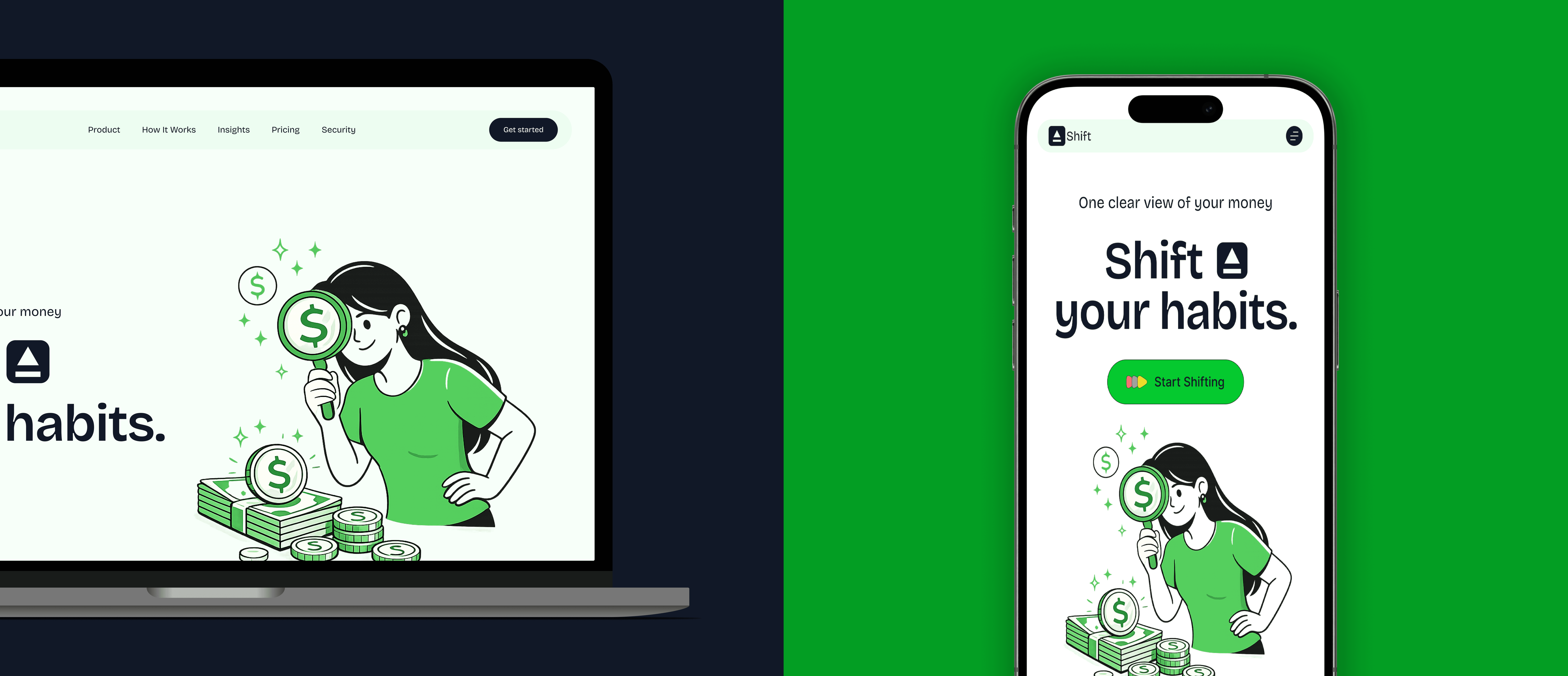
The visual identity The choice of a bold green as the primary color was intentional. Green carries associations with money and growth but more importantly it signals clarity and forward motion. Paired with clean sans-serif typography and generous whitespace, the palette makes a platform dealing with complex financial data feel approachable and modern rather than intimidating.
Cross-platform consistency Shift was designed for both web and mobile. The desktop experience provides the space for deeper analysis while the mobile experience strips everything back to what a user needs in a quick check. Both surfaces share the same design language so the product feels like one cohesive thing regardless of where you access it.
Insight-first layout Rather than leading with account balances and transaction lists, the layout leads with behavioral summaries and pattern recognition. The information architecture was rebuilt from scratch to serve this principle rather than retrofit it onto an existing structure.
Outcome
The redesign delivered a platform that clearly communicates its core differentiator from the first screen. Shift no longer looks or feels like another budgeting tool. It looks like what it is — a behavioral intelligence layer on top of your financial life.
The client received a complete high-fidelity UI system ready for development handoff, with a visual identity and product structure that can scale as the platform grows.

More Projects
Other work you might find interesting